If you're working on documentation, a website, or other user-facing content, it's helpful to know what users expect to find—both the information they want and how the information is organized and structured. After all, great content isn't very useful if people can't find what they're looking for.
Card sorting is a simple and effective way to gather input from users about what they expect from menu interfaces and pages. The simplest implementation is to label a stack of index cards with the sections you plan to include in your website or documentation and ask users to sort the cards in the way they would look for the information. Variations include letting people write their own menu headers or content elements.
The goal is to learn what your users expect and where they expect to find it, rather than having to figure out your menu and layout on your own. This is relatively straightforward when you have users in the same physical location, but it's more challenging when you are trying to get feedback from people in many locations.
I've found kanban boards are a great tool for these situations. They allow people to easily drag virtual cards around to categorize and rank them, and they are multi-purpose, unlike dedicated card-sorting software.
I often use Trello for card sorting, but there are several open source alternatives that you might want to try.
How it works
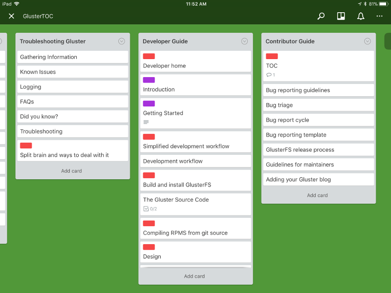
My most successful kanban experiment was when I was working on documentation for Gluster, a free and open source scalable network-attached storage filesystem. I needed to take a large pile of documentation that had grown over time and break it into categories to create a navigation system. BEcause I didn't have the technical knowledge necessary to sort it, I turned to the Gluster team and developer community for guidance.
First, I created a shared Kanban board. I gave the columns general names that would enable sorting and created cards for all the topics I planned to cover in the documentation. I flagged some cards with different colors to indicate either a topic was missing and needed to be created, or it was present and needed to be removed. Then I put all the cards into an "unsorted" column and asked people to drag them where they thought the cards should be organized and send me a screen capture of what they thought was the ideal state.

opensource.com
Dealing with all the screen captures was the trickiest part. I wish there was a merge or consensus feature that would've helped me aggregate everyone's data, rather than having to examine a bunch of screen captures. Fortunately, after the first person sorted the cards, people more or less agreed on the structure and made only minor modifications. When opinions differed on a topic's placement, I set up flash meetings where people could explain their thinking and we could hash out the disagreements.
Using the data
From here, it was easy to convert the information I captured into menus and refine it. If users thought items should become submenus, they usually told me in comments or when we talked on the phone. Perceptions of menu organization vary depending upon people's job tasks, so you never have complete agreement, but testing with users means you won't have as many blind spots about what people use and where they will look for it.
Pairing card sorting with analytics gives you even more insight on what people are looking for. Once, when I ran analytics on some training documentation I was working on, I was surprised that to learn that the most searched page was about title capitalization. So I surfaced that page at the top-menu level, even though my "logical" setting put it far down in a sub-menu.
I've found kanban card-sorting a great way to help me create content that users want to see and put it where they expect to find it. Have you found another great way to organize your content for users' benefit? Or another interesting use for kanban boards? If so, please share your thoughts in the comments.


3 Comments