Imagine you've just joined a new technology company, and one of the first tasks you're assigned is to improve and centralize the organization's developer-facing documentation. There's just one catch: That documentation exists in many different places, across several platforms, and differs markedly in accuracy, currency, and style.
So how did we tackle this challenge?
Understanding the scope
As with any project, we first needed to understand the scope and bounds of the problem we were trying to solve. What documentation was good? What was working? What wasn't? How much documentation was there? What format was it in? We needed to do a documentation audit. Luckily, Aneta Šteflová had recently published an article on OpenSource.com about this, and it provided excellent guidance.

Next, every piece of publicly facing documentation was assessed for the topic it covered, the medium it used, currency, and quality. A pattern quickly emerged that different platforms had major deficiencies, allowing us to make a data-driven approach to decommission our existing Jekyll-based sites. The audit also highlighted just how fragmented our documentation sources were—we had developer-facing documentation across no fewer than seven sites. Although search engines were finding this content just fine, the fragmentation made it difficult for developers and users of Mycroft—our primary audiences—to navigate the information they needed. Again, this data helped us make the decision to centralize our documentation on to one platform.
Choosing a central platform
As an organization, we wanted to constrain the number of standalone platforms in use. Over time, maintenance and upkeep of multiple platforms and integration touchpoints becomes cumbersome for any organization, but this is exacerbated for a small startup.
One of the other business drivers in platform choice was that we had two primary but very different audiences. On one hand, we had highly technical developers who we were expecting would push documentation to its limits—and who would want to contribute to technical documentation using their tools of choice—Git, GitHub, and Markdown. Our second audience—end users—would primarily consume technical documentation and would want to do so in an inviting, welcoming platform that was visually appealing and provided additional features such as the ability to identify reading time and to provide feedback. The ability to capture feedback was also a key requirement from our side as without feedback on the quality of the documentation, we would not have a solid basis to undertake continuous quality improvement.
Would we be able to identify one platform that met all of these competing needs?
We realised that two platforms covered all of our needs:
- WordPress: Our existing website is built on WordPress, and we have some reasonably robust WordPress skills in-house. The flexibility of WordPress also fulfilled our requirements for functionality like reading time and the ability to capture user feedback.
- GitHub: Almost all of Mycroft.AI's source code is available on GitHub, and our development team uses this platform daily.
But how could we marry the two?

Integrating WordPress and GitHub with WordPress GitHub Sync
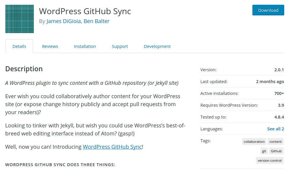
Luckily, our COO, Nate Tomasi, spotted a WordPress plugin that promised to integrate the two.
This was put through its paces on our test website, and it passed with flying colors. It was easy to install, had a straightforward configuration, which just required an OAuth token and webhook with GitHub, and provided two-way integration between WordPress and GitHub.
It did, however, have a dependency—on Markdown—which proved a little harder to implement. We trialed several Markdown plugins, but each had several quirks that interfered with the rendering of non-Markdown-based content. After several days of frustration, and even an attempt to custom-write a plugin for our needs, we stumbled across Parsedown Party. There was much partying! With WordPress GitHub Sync and Parsedown Party, we had integrated our two key platforms.
Now it was time to make our content visually appealing and usable for our user audience.
Reading time and feedback
To implement the reading time and feedback functionality, we built a new page template for WordPress, and leveraged plugins within the page template.
Knowing the estimated reading time of an article in advance has been proven to increase engagement with content and provides developers and users with the ability to decide whether to read the content now or bookmark it for later. We tested several WordPress plugins for reading time, but settled on Reading Time WP because it was highly configurable and could be easily embedded into WordPress page templates. Our decision to place Reading Time at the top of the content was designed to give the user the choice of whether to read now or save for later. With Reading Time in place, we then turned our attention to gathering user feedback and ratings for our documentation.


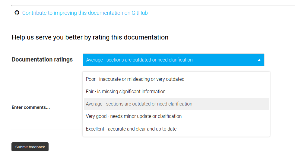
There are several rating and feedback plugins available for WordPress. We needed one that could be easily customized for several use cases, and that could aggregate or summarize ratings. After some experimentation, we settled on Multi Rating Pro because of its wide feature set, especially the ability to create a Review Ratings page in WordPress—i.e., a central page where staff can review ratings without having to be logged in to the WordPress backend. The only gap we ran into here was the ability to set the display order of rating options—but it will likely be added in a future release.
The WordPress GitHub Integration plugin also gave us the ability to link back to the GitHub repository where the original Markdown content was held, inviting technical developers to contribute to improving our documentation.
Updating the existing documentation
Now that the "container" for our new documentation had been developed, it was time to update the existing content. Because much of our documentation had grown organically over time, there were no style guidelines to shape how keywords and code were styled. This was tackled first, so that it could be applied to all content. You can see our content style guidelines on GitHub.
As part of the update, we also ran several checks to ensure that the content was technically accurate, augmenting the existing documentation with several images for better readability.
There were also a couple of additional tools that made creating internal links for documentation pieces easier. First, we installed the WP Anchor Header plugin. This plugin provided a small but important function: adding id content in GitHub using the markdown-toc library, then simply copied in to the WordPress content, where they would automatically link to the id attributes to each <h1>, <h2> (and so on) element. This meant that internal anchors could be automatically generated on the command line from the Markdown content in GitHub using the markdown-toc library, then simply copied in to the WordPress content, where they would automatically link to the id attributes generated by WP Anchor Header.
Next, we imported the updated documentation into WordPress from GitHub, and made sure we had meaningful and easy-to-search on slugs, descriptions, and keywords—because what good is excellent documentation if no one can find it?! A final activity was implementing redirects so that people hitting the old documentation would be taken to the new version.
What next?
Please do take a moment and have a read through our new documentation. We know it isn't perfect—far from it—but we're confident that the mechanisms we've baked into our new documentation infrastructure will make it easier to identify gaps—and resolve them quickly. If you'd like to know more, or have suggestions for our documentation, please reach out to Kathy Reid on Chat (@kathy-mycroft) or via email.
Reprinted with permission from Mycroft.ai.


Comments are closed.