Conversational interfaces are unique among the screen-based and physically manipulated user interfaces that characterize the range of digital experiences we encounter on a daily basis. As Conversational Design author Erika Hall eloquently writes, "Conversation is not a new interface. It's the oldest interface." And the conversation, the most human interaction of all, lies at the nexus of the aural and verbal rather than the visual and physical. This makes it particularly challenging for machines to meet the high expectations we tend to have when it comes to typical human conversations.
How do we design for conversational interfaces, which run the gamut from omnichannel chatbots on our websites and mobile apps to mono-channel voice assistants on physical devices such as the Amazon Echo and Google Home? What recommendations do other experts on conversational design and usability have when it comes to crafting the most robust chatbot or voice interface possible? In this overview, we focus on three areas: information architecture, design, and usability testing.
Information architecture: Trees, not sitemaps
Consider the websites we visit and the visual interfaces we use regularly. Each has a navigational tool, whether it is a list of links or a series of buttons, that helps us gain some understanding of the interface. In a web-optimized information architecture, we can see the entire hierarchy of a website and its contents in the form of such navigation bars and sitemaps.
On the other hand, in a conversational information architecture—whether articulated in a chatbot or a voice assistant—the structure of our interactions must be provided to us in a simple and straightforward way. For instance, in lieu of a navigation bar that has links to pages like About, Menu, Order, and Locations with further links underneath, we can create a conversational means of describing how to navigate the options we wish to pursue.
Consider the differences between the two examples of navigation below.
| Web-based navigation: Present all options in the navigation bar |
Conversational navigation: Present only certain top-level options to access deeper options |
| • Floss's Pizza • About ◦ Team ◦ Our story • Menu ◦ Pizzas ◦ Pastas ◦ Platters • Order ◦ Pickup ◦ Delivery • Where we are ◦ Area map |
• "Welcome to Floss's Pizza!" • "To learn more about us, say About" • "To hear our menu, say Menu" • "To place an order, say Order" • "To find out where we are, say Where" |
In a conversational context, an appropriate information architecture that focuses on decision trees is of paramount importance, because one of the biggest issues many conversational interfaces face is excessive verbosity. By avoiding information overload, prizing structural simplicity, and prescribing one-word directions, your users can traverse conversational interfaces without any additional visual aid.
Design: Finessing flows and language

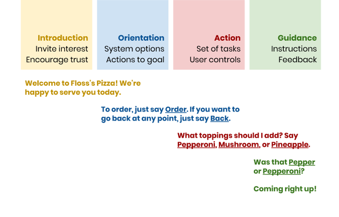
An example of well-designed language that encapsulates Hall's conversational key moments.
In her book Conversational Design, Hall emphasizes the need for all conversational interfaces to adhere to conversational maxims outlined by Paul Grice and advanced by Robin Lakoff. These conversational maxims highlight the characteristics every conversational interface should have to succeed: quantity (just enough information but not too much), quality (truthfulness), relation (relevance), manner (concision, orderliness, and lack of ambiguity), and politeness (Lakoff's addition).
In the process, Hall spotlights four key moments that build trust with users of conversational interfaces and give them all of the information they need to interact successfully with the conversational experience, whether it is a chatbot or a voice assistant.
-
Introduction: Invite the user's interest and encourage trust with a friendly but brief greeting that welcomes them to an unfamiliar interface.
-
Orientation: Offer system options, such as how to exit out of certain interactions, and provide a list of options that help the user achieve their goal.
-
Action: After each response from the user, offer a new set of tasks and corresponding controls for the user to proceed with further interaction.
-
Guidance: Provide feedback to the user after every response and give clear instructions.
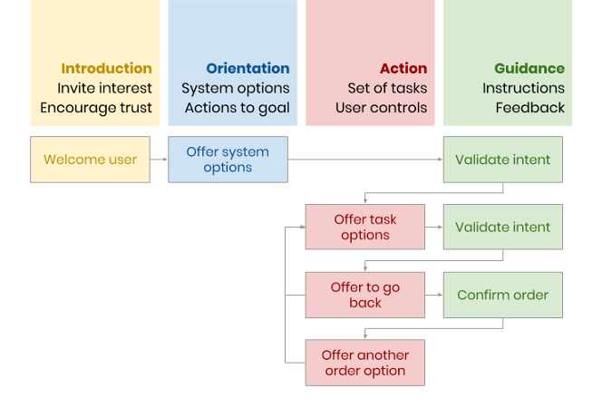
Taken as a whole, these key moments indicate that good conversational design obligates us to consider how we write machine utterances to be both inviting and informative and to structure our decision flows in such a way that they flow naturally to the user. In other words, rather than visual design chops or an eye for style, conversational design requires us to be good writers and thoughtful architects of decision trees.

An example decision flow that adheres to Hall's key moments.
One metaphor I use on a regular basis to conceive of each point in a conversational interface that presents a choice to the user is the dichotomous key. In tree science, dichotomous keys are used to identify trees in their natural habitat through certain salient characteristics. What makes dichotomous keys special, however, is the fact that each card in a dichotomous key only offers two choices (hence the moniker "dichotomous") with a clearly defined characteristic that cannot be mistaken for another. Eventually, after enough dichotomous choices have been made, we can winnow down the available options to the correct genus of tree.
We should design conversational interfaces in the same way, with particular attention given to disambiguation and decision-making that never verges on too much complexity. Because conversational interfaces require deeply nested hierarchical structures to reach certain outcomes, we can never be too helpful in the instructions and options we offer our users.
Usability testing: Dialogues, not dialogs
Conversational usability is a relatively unexplored and less-understood area because it is frequently based on verbal and aural interactions rather than visual or physical ones. Whereas chatbots can be evaluated for their usability using traditional means such as think-aloud, voice assistants and other voice-driven interfaces have no such luxury.
For voice interfaces, we are unable to pursue approaches involving eye-tracking or think-aloud, since these interfaces are purely aural and users' utterances outside of responses to interface prompts can introduce bad data. For this reason, when our Acquia Labs team built Ask GeorgiaGov, the first Alexa skill for residents of the state of Georgia, we chose retrospective probing (RP) for our usability tests.
In retrospective probing, the conversational interaction proceeds until the completion of the task, at which point the user is asked about their impressions of the interface. Retrospective probing is well-positioned for voice interfaces because it allows the conversation to proceed unimpeded by interruptions such as think-aloud feedback. Nonetheless, it does come with the disadvantage of suffering from our notoriously unreliable memories, as it forces us to recollect past interactions rather than ones we completed immediately before recollection.
Challenges and opportunities
Conversational interfaces are here to stay in our rapidly expanding spectrum of digital experiences. Though they enrich the range of ways we have to engage users, they also present unprecedented challenges when it comes to information architecture, design, and usability testing. With the help of previous work such as Grice's conversational maxims and Hall's key moments, we can design and build effective conversational interfaces by focusing on strong writing and well-considered decision flows.
The fact that conversation is the oldest and most human of interfaces is also edifying when we approach other user interfaces that lack visual or physical manipulation. As Hall writes, "The ideal interface is an interface that's not noticeable at all." Whether or not we will eventually reach the utopian outcome of conversational interfaces that feel completely natural to the human ear, we can make conversational interfaces more human-centered by freeing our thinking from the trappings of web and mobile.
Preston So will present Talk Over Text: Conversational Interface Design and Usability at All Things Open, October 21-23 in Raleigh, North Carolina.


Comments are closed.