Would you pay $20 for a Linux desktop? I would, and in fact, I regularly choose to pay more than that when I download free software! The reason I do this is that open source is worth it. For a copy of Elementary OS, US$ 20 happens to be the default asking price (you can download it for $1 or even $0 if you can't afford anything more). What you get in return is an excellent and heavily curated distribution that ships with its own Pantheon desktop design.
You may find Pantheon included in a software repository, as it is open source, but more likely, you'll have to download and install Elementary Linux to experience it. If you're not ready to install Elementary on your computer as the main OS, you can install it into a virtual machine, like GNOME Boxes.
The Pantheon desktop is clean, attractive, and features many of the little things many users want in a desktop but could never quite get from the usual Linux desktops.
Pantheon desktop tour
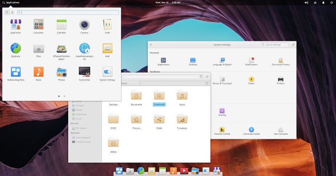
At first glance, the Pantheon desktop looks a little like Cinnamon or Budgie or the Classic mode of GNOME 3. However, the most exciting features of Pantheon are the smallest touches. It excels in all the places you notice the very least, until that place is the only thing you're looking at one day, and you realize that the way it works has literally improved your quality of life, to say nothing of making your day a lot nicer.
The clearest example of this is file name highlighting. For decades, Mac OS has had a much-loved feature whereby you can highlight the displayed name of an important file. People use this feature as a quick visual indicator to tell themselves which file is the "best" version of several, or which file should be sent to a friend, or which file still needs work. They're arbitrary colors and can mean whatever the user wants them to mean. Most importantly, it's noticeable visual metadata.
Users switching from Mac OS tend to miss this feature in GNOME and KDE and every other desktop option Linux has on offer. Pantheon quietly and casually solves that problem.
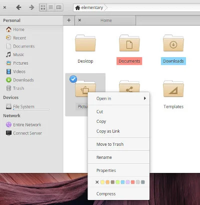
Of course, that's just one example of many. Pantheon is filled with small features that you don't think about until you need them.
The desktop is refined and attractive, with all the intuitive parts that have disappeared from many other desktops. In many ways, it has taken the best of the good ideas of many different interfaces and refrained from implementing the excesses.
Customizing the Pantheon desktop
The Pantheon desktop represents a pretty clear vision of how a computer ought to be operated. The "problem" with this kind of design (outside of open source, at least) is that one person's preference may not be another person's efficiency.
But this is open source. Things can be changed, and whatever can't be changed can be discarded for a different option. Pantheon is definitely a desktop for a specific set of users, but even those of us with our own expectations of how a desktop ought to work might find Pantheon refreshingly more flexible than it first appears. There are overrides for many built-in designs, and when you can't adjust something to your liking, you can easily choose an alternative application. The theme engine ensures that your replacement application looks integrated with the rest of your desktop, and the usual Linux system buses ensure that all of your chosen applications communicate with one another as expected.
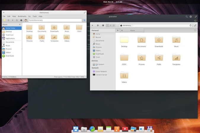
As compromises go, this one does a lot to meet you halfway.
A welcome addition
Etymology aside, this desktop truly is an answer to the prayers of many Linux users. Whether it's your style or not, the Pantheon desktop is an important and welcome addition to the Linux user experience. Try it for yourself and see if it's the good news you've been waiting for.






Comments are closed.