In part one of this series, we began by using Python and Apache Spark to process and wrangle our example web logs into a format fit for analysis, a vital technique considering the massive amount of log data generated by most organizations today. We set up environment variables, dependencies, loaded the necessary libraries for working with both DataFrames and regular expressions, and of course loaded the example log data. Then we wrangled our log data into a clean, structure, and meaningful format. Here in part two, we focus on analyzing that data.
Data analysis on our web logs
Now that we have a DataFrame containing the parsed and cleaned log file as a data frame, we can perform some interesting exploratory data analysis (EDA) to try and get some interesting insights!
Content size statistics
Let’s compute some statistics regarding the size of content our web server returns. In particular, we’d like to know the average, minimum, and maximum content sizes.
We compute these statistics by calling .describe() on the content_size column of logs_df. The .describe() function returns the count, mean, stddev, min, and max of a given column in this format:
content_size_summary_df = logs_df.describe(['content_size'])
content_size_summary_df.toPandas()
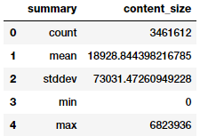
The size of the content delivered analyzed using .describe().
Alternatively, we can use SQL to directly calculate these statistics. The pyspark.sql.functions module has many useful functions, see the documentation to learn more.
After we apply the .agg() function, we call toPandas() to extract and convert the result into a pandas DataFrame, which offers better formatting on Jupyter Notebook:
from pyspark.sql import functions as F

(logs_df.agg(F.min(logs_df['content_size']).alias('min_content_size'),
             F.max(logs_df['content_size']).alias('max_content_size'),
             F.mean(logs_df['content_size']).alias('mean_content_size'),
             F.stddev(logs_df['content_size']).alias('std_content_size'),
             F.count(logs_df['content_size']).alias('count_content_size'))
        .toPandas())
The same data reformatted into a pandas dataframe.
When we validate the results, we see that they are the same as expected.
HTTP status code analysis
Next, let’s look at the log's status code values to see which status code values appear and how many times. We again start with logs_df, group by the status column, apply the .count() aggregation function, and then sort by the status column:
status_freq_df = (logs_df
                     .groupBy('status')
                     .count()
                     .sort('status')
                     .cache())
print('Total distinct HTTP Status Codes:', status_freq_df.count())
Total Distinct HTTP Status Codes: 8
Let’s take a look at each status code's occurrences in the form of a frequency table:
status_freq_pd_df = (status_freq_df
                         .toPandas()
                         .sort_values(by=['count'],
                                      ascending=False))
status_freq_pd_df
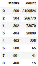
How many times each status code appears in your log.
Looks like the most frequent status code is 200—OK—which is a good sign that things are working normally most of the time. Let’s visualize this:
import matplotlib.pyplot as plt
import seaborn as sns
import numpy as np
%matplotlib inline

sns.catplot(x='status', y='count', data=status_freq_pd_df,
            kind='bar', order=status_freq_pd_df['status'])
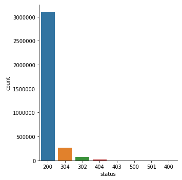
HTTP status code occurrences in a bar chart.
Not too bad. But several status codes are nearly invisible due to the data's huge skew. Let’s do a log transform and see if things improve. Usually log transforms help us transform highly skewed data to an approximate normal distribution, so that we can visualize the data distribution in a more comprehensible manner:
log_freq_df = status_freq_df.withColumn('log(count)',
                                        F.log(status_freq_df['count']))
log_freq_df.show()
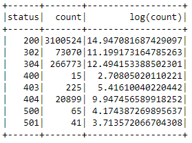
Error code frequency as a log transform.
The results definitely look good and seem to have handled the skew, let’s verify this by visualizing this data:
log_freq_pd_df = (log_freq_df
                    .toPandas()
                    .sort_values(by=['log(count)'],
                                 ascending=False))
sns.catplot(x='status', y='log(count)', data=log_freq_pd_df,
            kind='bar', order=status_freq_pd_df['status'])
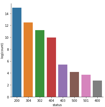
HTTP status code frequency bar chart, after a log transform.
This chart definitely looks much better and less skewed, giving us a better idea of the distribution of status codes!
Analyzing frequent hosts
Let’s look at hosts that access the server frequently by getting the total count of accesses by each host, sorting by the number of accesses, and displaying only the top 10 most frequent hosts:
host_sum_df =(logs_df
               .groupBy('host')
               .count()
               .sort('count', ascending=False).limit(10))

host_sum_df.show(truncate=False)
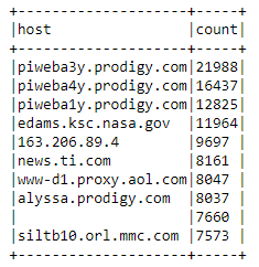
Hosts that frequently access the server sorted by number of accesses via host_sum_df.
This table looks good, but let’s inspect the blank record in row number 9 more closely:
host_sum_pd_df = host_sum_df.toPandas()
host_sum_pd_df.iloc[8][‘host’]
''
Looks like one of the top hostnames is an empty string. This example teaches us a valuable lesson: don't just check for nulls when data wrangling, also check for empty strings.
Display the top 20 most frequent endpoints
Now, let’s visualize the number of endpoint URI hits in the log. To perform this task, start with logs_df and then group by the endpoint column, aggregate by count, and sort in descending order like the previous example:
paths_df = (logs_df
            .groupBy('endpoint')
            .count()
            .sort('count', ascending=False).limit(20))

paths_pd_df = paths_df.toPandas()
paths_pd_df
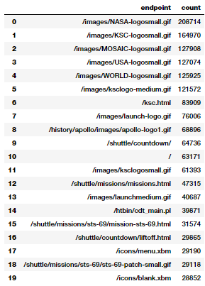
The number of hits to each endpoint URI in descending order via paths_df
Not surprisingly, the most accessed assets are GIFs, the home page, and some CGI scripts.
Display the top 10 error endpoints
What are the top 10 endpoints requested which did not have return code 200 (HTTP Status OK)? To find out, we create a sorted list containing the endpoints and the number of times they were accessed with a non-200 return code, and then show the top 10:
not200_df = (logs_df
               .filter(logs_df['status'] != 200))

error_endpoints_freq_df = (not200_df
                               .groupBy('endpoint')
                               .count()
                               .sort('count', ascending=False)
                               .limit(10)
                          )

error_endpoints_freq_df.show(truncate=False)
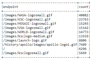
The top ten error endpoints and their frequency via error_endpoints_freq_df
Looks like GIFs (animated/static images) are failing to load the most. Why would that be? Well given that these logs are from 1995, and given the internet speed we had back then, I’m not surprised!
Total number of unique hosts
How many unique hosts visited the NASA website in these two months? We can find this out with a few transformations:
unique_host_count = (logs_df
                     .select('host')
                     .distinct()
                     .count())
unique_host_count
137933
Number of unique daily hosts
For an advanced example, let’s look at how to determine the number of unique hosts on a day-by-day basis. Here we’d like a DataFrame that includes the day of the month and the associated number of unique hosts for that day, sorted by increasing day of the month.
Think about the steps you need to perform for this task. Since each of these logs only covers a single month, you can ignore the month issue, at least. For data spanning multiple months, we would need to consider both month and day when doing the necessary aggregations. You may want to use the pyspark.sql.functions module's dayofmonth() function (which we have already imported as F at the beginning of this tutorial).
Start with host_day_df, which is a DataFrame with two columns:

The columns in the host_day_df dataframe.
There is one row in this DataFrame for each row in logs_df. Essentially, we're just transforming each row. For example, for this row:
unicomp6.unicomp.net - - [01/Aug/1995:00:35:41 -0400] "GET /shuttle/missions/sts-73/news HTTP/1.0" 302 -your host_day_df should have unicomp6.unicomp.net 1
host_day_df = logs_df.select(logs_df.host,
                             F.dayofmonth('time').alias('day'))
host_day_df.show(5, truncate=False)
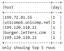
The top five hosts making requests on the first day via host_day_df
Next is host_day_distinct_df, which is a DataFrame with the same columns as host_day_df, but with duplicate (day, host) rows removed:
host_day_df = logs_df.select(logs_df.host,
                             F.dayofmonth('time').alias('day'))
host_day_df.show(5, truncate=False)

host_day_distinct_df gives the same output as host_day_df, but with duplicate rows removed.
Another option is daily_unique_hosts_df, which is a DataFrame with two columns, one different from the previous DataFrames:

The days of the month and the number of unique hosts making requests each day via daily_unique_hosts_df
def_mr = pd.get_option('max_rows')
pd.set_option('max_rows', 10)

daily_hosts_df = (host_day_distinct_df
                     .groupBy('day')
                     .count()
                     .sort("day"))

daily_hosts_df = daily_hosts_df.toPandas()
daily_hosts_df
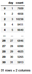
daily_unique_hosts_df shows the day of the month and the number of unique hosts making requests that day.
This result gives us a nice DataFrame showing the total number of unique hosts per day. Let’s visualize this:
c = sns.catplot(x='day', y='count',
                data=daily_hosts_df,
                kind='point', height=5,
                aspect=1.5)
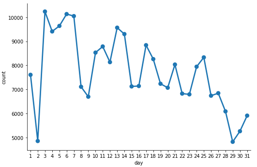
Unique hosts per day charted using daily_unique_hosts_df
Average number of daily requests per host
In the previous example, we looked at one way to determine the number of unique hosts in the entire log on a day-by-day basis. Let’s now find the average number of requests made per host to the NASA website per day. Here, we’d like a DataFrame sorted by increasing day of the month which includes the day of the month and the associated number of average requests made for that day per host:
daily_hosts_df = (host_day_distinct_df
                     .groupBy('day')
                     .count()
                     .select(col("day"),
                                      col("count").alias("total_hosts")))

total_daily_reqests_df = (logs_df
                              .select(F.dayofmonth("time")
                                          .alias("day"))
                              .groupBy("day")
                              .count()
                              .select(col("day"),
                                      col("count").alias("total_reqs")))

avg_daily_reqests_per_host_df = total_daily_reqests_df.join(daily_hosts_df, 'day')
avg_daily_reqests_per_host_df = (avg_daily_reqests_per_host_df
                                    .withColumn('avg_reqs', col('total_reqs') / col('total_hosts'))
                                    .sort("day"))
avg_daily_reqests_per_host_df = avg_daily_reqests_per_host_df.toPandas()
avg_daily_reqests_per_host_df
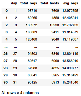
The average number of daily requests per host via avg_daily_reqests_per_host_df.
Now we can visualize the average daily requests per host:
c = sns.catplot(x='day', y='avg_reqs',
                data=avg_daily_reqests_per_host_df,
                kind='point', height=5, aspect=1.5)
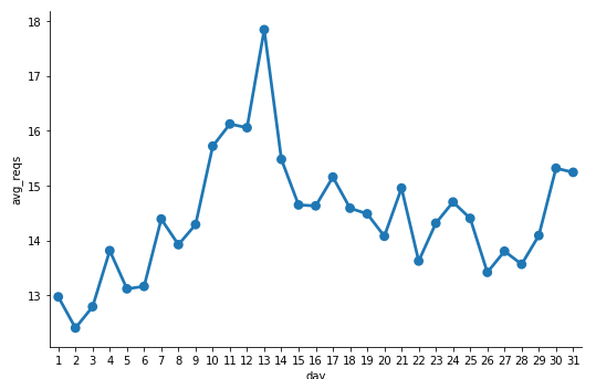
The average number of daily requests per host charted.
It looks like day 13 got the maximum number of requests per host.
Counting 404 response codes
Create a DataFrame containing only log records with a 404 status code (Not Found). We make sure to cache() the not_found_df DataFrame as we will use it in the rest of the examples here. How many 404 records do you think are in the logs?
not_found_df = logs_df.filter(logs_df["status"] == 404).cache()
print(('Total 404 responses: {}').format(not_found_df.count()))
Total 404 responses: 20899
Listing the top twenty 404 response code endpoints
Using the DataFrame that we cached earlier—containing only log records with a 404 response code—we will now print out a list of the top twenty endpoints generating the most 404 errors. Remember, whenever you generate top endpoints, they should be in sorted order:
endpoints_404_count_df = (not_found_df
                          .groupBy("endpoint")
                          .count()
                          .sort("count", ascending=False)
                          .limit(20))

endpoints_404_count_df.show(truncate=False)
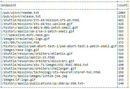
The top 20 response code endpoints, sorted, thanks to endpoints_404_count_df.
Listing the top twenty 404 response code hosts
Using the DataFrame that we cached earlier which contains only log records with a 404 response code, we can now print out a list of the top twenty hosts that generate the most 404 errors. Again, remember that top hosts should be in sorted order:
hosts_404_count_df = (not_found_df
                          .groupBy("host")
                          .count()
                          .sort("count", ascending=False)
                          .limit(20))

hosts_404_count_df.show(truncate=False)
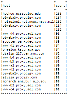
The top twenty 404 response code hosts via hosts_404_count_df.
This output gives us a good idea which hosts end up generating the most 404 errors for the NASA webpage.
Visualizing 404 errors per day
Let’s now explore our 404 records temporally (by time). Similar to the example showing the number of unique daily hosts, we'll break down the 404 requests by day and sor the daily counts by day in errors_by_date_sorted_df:
errors_by_date_sorted_df = (not_found_df
                                .groupBy(F.dayofmonth('time').alias('day'))
                                .count()
                                .sort("day"))

errors_by_date_sorted_pd_df = errors_by_date_sorted_df.toPandas()
errors_by_date_sorted_pd_df
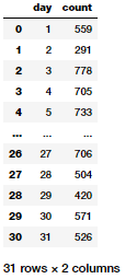
How many times each status code appears via status_freq_df.
Now let’s visualize the total 404 errors per day now:
c = sns.catplot(x='day', y='count',
                data=errors_by_date_sorted_pd_df,
                kind='point', height=5, aspect=1.5)
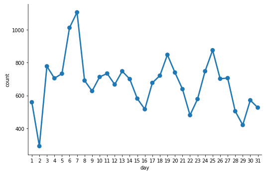
Total 404 errors per day.
Top three days for 404 errors
Based on the earlier plot, what are the top three days of the month with the most 404 errors? Knowing this can help us diagnose and drill down further into these specfic days to figure out what might have gone wrong (server issues, DNS issues, denial of service, latency problems, maintenance and so on). We can leverage our previously created errors_by_date_sorted_df DataFrame to answer this question:
(errors_by_date_sorted_df
    .sort("count", ascending=False)
    .show(3))
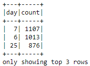
The top 3 days of 404 errors via errors_by_date_sorted_df.
Visualizing hourly 404 errors
Using the DataFrame not_found_df that we cached earlier, we can now group and sort by hour of the day in increasing order. We'll use this process to create a DataFrame containing the total number of 404 responses for HTTP requests for each hour of the day (midnight starts at 0). Then we will build a visualization from the DataFrame.
hourly_avg_errors_sorted_df = (not_found_df
                                   .groupBy(F.hour('time')
                                             .alias('hour'))
                                   .count()
                                   .sort('hour'))
hourly_avg_errors_sorted_pd_df = hourly_avg_errors_sorted_df.toPandas()

c = sns.catplot(x='hour', y='count',
                data=hourly_avg_errors_sorted_pd_df,
                kind='bar', height=5, aspect=1.5)
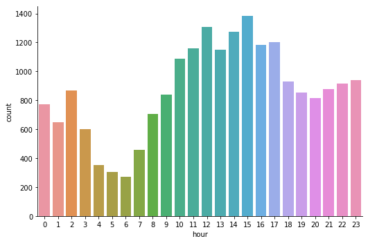
Total 404 errors per hour in a bar chart.
Looks like total 404 errors occur the most in the afternoon and the least in the early morning. We can now reset the maximum rows displayed by pandas to the default value since we had changed it earlier to display a limited number of rows.
pd.set_option(‘max_rows’, def_mr)Conclusion
We took a hands-on approach to data wrangling, parsing, analysis and visualization at scale on a very common yet essential case-study on Log Analytics. While the data we worked on here may not be ‘Big Data’ from a size or volume perspective, these techniques and methodologies are generic enough to scale for larger volumes of data. I hope this exercise gave you ideas on how you might leverage open source frameworks like Apache Spark to work with your own structured and semi-structured data!
You can find all the code and analyses accompanying this article in my GitHub repository. Also, you can find a step-by-step approach in this Jupyter Notebook.
Interested in understanding Spark SQL and DataFrames? Check out my hands-on tutorial on opensource.com!
In case you have any feedback or queries, you can leave a comment here or reach out to me on LinkedIn.
This article originally appeared on Medium's Towards Data Science channel and is republished with permission.


1 Comment