The KDE Plasma Desktop has a lot to offer—a great desktop, a flexible file manager, and tightly integrated applications. However, it can be easy to overlook its default text editors, one of which is Kate. On December 14, 2020, Kate turns 20 years old, and in its two decades of development, it has achieved a perfect balance between a straightforward editor and a modest Integrated Development Environment (IDE).
Installing Kate
If you’re running the KDE Plasma Desktop, you probably already have Kate installed. In the event that it’s not installed yet, you can find it in your software repository, regardless of which desktop you’re running.
Alternatively, you can install Kate from Flathub.org using Flatpak on Linux or Chromebook.
On Windows, you can obtain Kate from the Windows store.
To install it on macOS, download the macOS build from the KDE build site.
All the right features
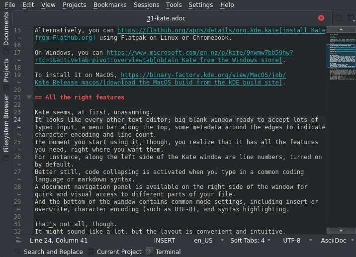
Kate seems, at first, unassuming. It looks like every other text editor—a big blank window ready to accept lots of typed input, a menu bar along the top, some metadata around the edges to indicate character encoding and line count. The moment you start using it, though, you realize that it has all the features you need, right where you want them.
For instance, along the left side of the Kate window are line numbers, which are enabled by default. Better still, code collapsing is activated when you type in a common coding language or markdown syntax. A document navigation panel on the right side of the window provides quick and visual access to different parts of your file. And the bottom of the window contains common mode settings, including insert or overwrite, character encoding (such as UTF-8), and syntax highlighting.

That’s not all, though. It might sound like a lot, but the layout is convenient and intuitive. There are even more features available in the menu and settings.
Kate features Git integration, a file browser, shell, open document or project panel, word completion, XML completion, a tabbed interface, split screens, and a plugin structure so you can extend its features even further.
An editor for every user
Kate’s extreme flexibility allows it to be both a simple text editor and a robust IDE. By defaulting to a familiar interface, it appeals to a wide audience, but by offering the ability to integrate with debuggers, compilers, and code linters, it appeals to developers.
Because it allows the user to control its UI layout, Kate ensures every user can optimize their experience with it. This has been, traditionally, a difficult balance—an editor with too many features feels too much like a bloated IDE, while an editor with a simplistic interface and obfuscated features feels basic or inconvenient. Kate gets it right by placing the really useful features at the forefront of the UI for everyone to enjoy while keeping advanced features discoverable but out of the way.
Kate is, frankly, difficult to walk away from. It’s a pleasure to use, easy to configure, and fun to explore. Install Kate today, and give it a try. Being available on all major platforms, there’s little reason you shouldn’t choose Kate as your new favorite editor.


2 Comments