The spread of disease is a real concern for a world in which global travel is commonplace. A few organizations track significant epidemics (and any pandemic), and fortunately, they publish their work as open data. The raw data can be difficult for humans to process, though, and that's why data science is so vital. For instance, it could be useful to visualize the worldwide spread of COVID-19 with Python and Pandas.
It can be hard to know where to start when you're faced with large amounts of raw data. The more you do it, however, the more patterns begin to emerge. Here's a common scenario, applied to COVID-19 data:
- Download COVID-19 country spread daily data into a Pandas DataFrame object from GitHub. For this, you need the Python Pandas library.
- Process and clean the downloaded data and make it suitable for visualizing. The downloaded data (as you will see for yourself) is in quite good condition. The one problem with this data is that it uses the names of countries, but it's better to use three-digit ISO 3 codes. To generate the three-digit ISO 3 codes, use a small Python library called pycountry. Having generated these codes, you can add an extra column to our DataFrame and populate it with these codes.
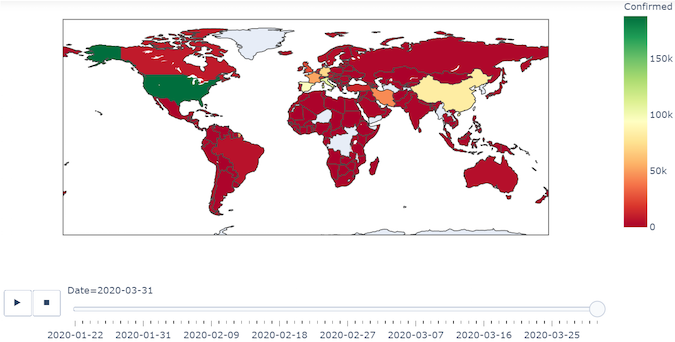
- Finally, for the visualization, use the express module of a library called Plotly. This article uses what are called choropleth maps (available in Plotly) to visualize the worldwide spread of the disease.
Step 1: Corona data
We will download the latest corona data from:
https://raw.githubusercontent.com/datasets/covid-19/master/data/countries-aggregated.csv
We will load the data directly into a Pandas DataFrame. Pandas provides a function, read_csv(), which can take a URL and return a DataFrame object as shown below:
import pycountry
import plotly.express as px
import pandas as pd
URL_DATASET = r'https://raw.githubusercontent.com/datasets/covid-19/master/data/countries-aggregated.csv'
df1 = pd.read_csv(URL_DATASET)
print(df1.head(3))  # Get first 3 entries in the dataframe
print(df1.tail(3))  # Get last 3 entries in the dataframe
The screenshot of output (on Jupyter) is:

From output, you can see that the DataFrame (df1) has the following columns:
- Date
- Country
- Confirmed
- Recovered
- Dead
Further, you can see that the Date column has entries starting from January 22 to March 31. This database is updated daily, so you will get the current values.
Step 2: Cleaning and modifying the data frame
We need to add another column to this DataFrame, which has the three-letter ISO alpha-3 codes. To do this, I followed these steps:
- Create a list of all countries in the database. This was required because in the df, in the column Country, each country was figuring for each date. So in effect, the Country column had multiple entries for each country. To do this, I used the unique().tolist() functions.
- Then I took a dictionary d_country_code (initially empty) and populated it with keys consisting of country names and values consisting of their three-letter ISO codes.
- To generate the three-letter ISO code for a country, I used the function pycountry.countries.search_fuzzy(country). You need to understand that the return value of this function is a "list of Country objects." I passed the return value of this function to a name country_data. Further, in this list of objects, the first object i.e., at index 0, is the best fit. Further, this \ object has an attribute alpha_3. So, I can "access" the 3 letter ISO code by using country_data[0].alpha_3. However, it is possible that some country names in the DataFrame may not have a corresponding ISO code (For example, disputed territories). So, for such countries, I gave an ISO code of "i.e. a blank string. Further, you need to wrap this code in a try-except block. The statement: print(‘could not add ISO 3 code for ->', country) will give a printout of those countries for which the ISO 3 codes could not be found. In fact, you will find such countries as shown with white color in the final output.
- Having got the three-letter ISO code for each country (or an empty string for some), I added the country name (as key) and its corresponding ISO code (as value) to the dictionary d_country_code. For adding these, I used the update() method of the Python dictionary object.
- Having created a dictionary of country names and their codes, I added them to the DataFrame using a simple for loop.
Step 3: Visualizing the spread using Plotly
A choropleth map is a map composed of colored polygons. It is used to represent spatial variations of a quantity. We will use the express module of Plotly conventionally called px. Here we show you how to create a choropleth map using the function: px.choropleth.
The signature of this function is:
plotly.express.choropleth(data_frame=None, lat=None, lon=None, locations=None, locationmode=None, geojson=None, featureidkey=None, color=None, hover_name=None, hover_data=None, custom_data=None, animation_frame=None, animation_group=None, category_orders={}, labels={}, color_discrete_sequence=None, color_discrete_map={}, color_continuous_scale=None, range_color=None, color_continuous_midpoint=None, projection=None, scope=None, center=None, title=None, template=None, width=None, height=None)The noteworthy points are that the choropleth() function needs the following things:
- A geometry in the form of a geojson object. This is where things are a bit confusing and not clearly mentioned in its documentation. You may or may not provide a geojson object. If you provide a geojson object, then that object will be used to plot the earth features, but if you don't provide a geojson object, then the function will, by default, use one of the built-in geometries. (In our example here, we will use a built-in geometry, so we won't provide any value for the geojson argument)
- A pandas DataFrame object for the attribute data_frame. Here we provide our DataFrame ie df1 we created earlier.
- We will use the data of Confirmed column to decide the color of each country polygon.
- Further, we will use the Date column to create the animation_frame. Thus as we slide across the dates, the colors of the countries will change as per the values in the Confirmed column.
The complete code is given below:
import pycountry
import plotly.express as px
import pandas as pd
# ----------- Step 1 ------------
URL_DATASET = r'https://raw.githubusercontent.com/datasets/covid-19/master/data/countries-aggregated.csv'
df1 = pd.read_csv(URL_DATASET)
# print(df1.head) # Uncomment to see what the dataframe is like
# ----------- Step 2 ------------
list_countries = df1['Country'].unique().tolist()
# print(list_countries) # Uncomment to see list of countries
d_country_code = {}  # To hold the country names and their ISO
for country in list_countries:
    try:
        country_data = pycountry.countries.search_fuzzy(country)
        # country_data is a list of objects of class pycountry.db.Country
        # The first item  ie at index 0 of list is best fit
        # object of class Country have an alpha_3 attribute
        country_code = country_data[0].alpha_3
        d_country_code.update({country: country_code})
    except:
        print('could not add ISO 3 code for ->', country)
        # If could not find country, make ISO code ' '
        d_country_code.update({country: ' '})

# print(d_country_code) # Uncomment to check dictionary

# create a new column iso_alpha in the df
# and fill it with appropriate iso 3 code
for k, v in d_country_code.items():
    df1.loc[(df1.Country == k), 'iso_alpha'] = v

# print(df1.head)  # Uncomment to confirm that ISO codes added
# ----------- Step 3 ------------
fig = px.choropleth(data_frame = df1,
                    locations= "iso_alpha",
                    color= "Confirmed",  # value in column 'Confirmed' determines color
                    hover_name= "Country",
                    color_continuous_scale= 'RdYlGn',  #  color scale red, yellow green
                    animation_frame= "Date")

fig.show()
The output is something like the following:

You can download and run the complete code.
To wrap up, here are some excellent resources on choropleth in Plotly:


5 Comments