The GNOME desktop environment has been through many changes since its initial release in March 1999. For most of this time, the open source project has issued updates twice a year, which gives users predictability in when they can expect new features to land on their Linux and other Unix-like desktops. Its latest release, GNOME 3.36, came out in March, and the project is preparing to issue its next iteration in September. To learn about what's new in GNOME, I spoke with Emmanuele Bassi.
Emmanuele has been contributing to GNOME for more than 15 years. He started as the maintainer of language bindings that allow developers to use GNOME libraries in other programming languages, then moved on to contribute to GTK (a cross-platform widget for developing GNOME apps) and other parts of GNOME. In 2018, GNOME hired Emmanuele as a full-time GTK Core Developer, where he works on GTK and the GNOME application development platform.
Jim Hall: GNOME 3.36 was released in March 2020. What are some of the major features people should know about?
Emmanuele Bassi: GNOME has followed a release schedule for the last 18 or so years. GNOME doesn't release when a new feature is ready; we release when it's time. That simplifies the new releases. There isn't a "next big thing" in GNOME. Instead, it's just a new release every six months. We always fix bugs, add new features, and polish up what's there.
This release was really about making sure all the features were nice to use and pleasant to use. In GNOME 3.36, there's a lot that improves the user experience. One thing I like is the ability to turn off notifications. This is a feature that was available in a very old version of GNOME but was removed a while back because the mechanism underneath it wasn't very reliable. But we added it back because this feature is so useful and important to a lot of people.
You can toggle notifications on and off for everything or set them for each application you use. You can find this setting in the GNOME Settings app, under the Applications menu.
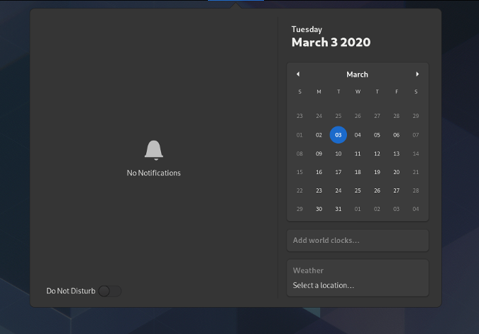
Click "Do Not Disturb" to turn off notifications. (GNOME, CC BY-SA 4.0)
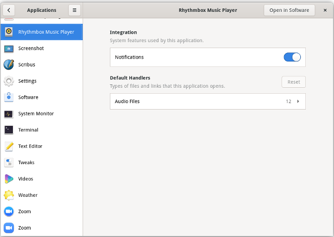
You can turn off notifications for individual applications in the Settings app. (Jim Hall, CC BY-SA 4.0)
We also added extra polish to the GNOME lock screen. This updated lock screen has been in the works for ages, and now it's ready. The new GNOME lock screen will blur the background of your current workspace but doesn't show your running applications. It's a great feature for the user experience. We've been working on that for the last three or four cycles, and we fixed a lot of things along the way to make that work well.
Another thing that's important for user experience is that [there is a new] place to put all the extensions. [It was in] GNOME Software Center, but no one knew to look there. Now there's a separate application to manage it.
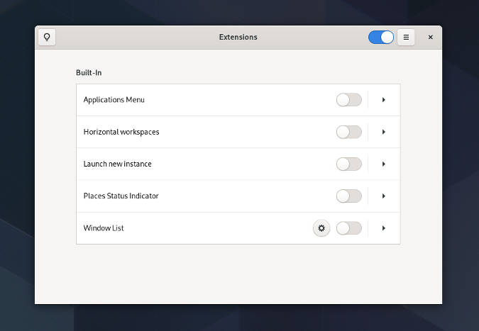
The new Extensions app lets you change extension preferences or turn off extensions you don't want. (GNOME, CC BY-SA 4.0)
And there's lots of little polish added to the GNOME Shell itself. For example, the application folders in the GNOME Shell application launcher are a great new feature. It's really easy to create your own application groups or folders in the launcher. A lot of people had asked for this for a long time. Application folders actually landed in an earlier GNOME release, but [the feature] needed extra work to make it really great, and that's what you see in GNOME 3.36.
JH: What are some features of GNOME that more people should know about?
EB: I don't know that there are other features that are really big in GNOME 3.36. If you're already using GNOME, the biggest thing you'll see is the improved user experience. If you aren't using GNOME, then the big thing is the consistent behavior in using GNOME. It's about a smooth experience with your computer, like your computer isn't going to be bothering you.
Password fields are easier. This used to be in a menu that you had to know existed if you wanted to use it, but now it's right there.
JH: This is a great feature if you use long and complex passwords, like me. In any GNOME prompt where you would type in a password, you can click a little icon to expose your password to make sure you typed it correctly.
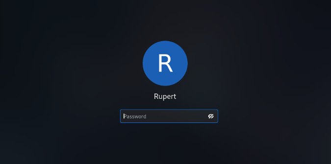
The lock screen includes the new "show your password" feature. (GNOME, CC BY-SA 4.0)
EB: The new application folders in the GNOME application launcher is another [feature to know about]. The folders are easier to see, and they look great. GNOME will suggest a name for the application folder, but it's really easy to give that folder a different name.
And more applications in GNOME are now responsive to being resized. They changed that in the user interface. The Settings app is a good example of that. If you make it too narrow, it changes how it displays things. We've been working on this for a while because of companies like Purism that are putting GNOME on other display sizes like phones or anyone who is using GNOME on other form factors.
You don't notice some of the changes until you use them. There are lots of great features to see and that allow you to use GNOME in different ways.
JH: As a GNOME developer and user, what GNOME features do you find most useful in your daily work?
EB: I get a lot of use in the keyboard navigation. I use the keyboard all the time, so I live with my hands on the keyboard. When I use the mouse, I sometimes can get RSI (repetitive strain injury) by using it too much. Being able to use the keyboard for everything is great.
The keyboard shortcuts are part of the GNOME Accessibility. It's also part of a design direction to be able to count on keyboard shortcuts for things. Keyboard accessibility is a core part of the design language; it's not a side feature that will be dropped someday.
And having multiple windows on the screen and being able to tile them up, so I have two windows side by side. That, and multiple workspaces. I used to micromanage my workspaces back in the 1990s with different virtual desktops. But I'd always create more virtual desktops than I needed. But in GNOME, it's easy enough to create a new workspace if you need it, and when you don't need it, it's gone.
JH: We're already in the GNOME 3.37 development cycle, with GNOME 3.38 planned for September 2020. What are some new features showing up that will interest people?
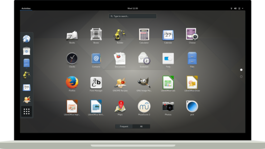
EB: There are new changes all the time. One thing we're working on is the application grid and making that customizable. Right now, the applications are listed alphabetically, but you will be able to drag them around in any order you want. That will finish a massive change that's been in the works for five years or more. The goal is to be less automated and more user-driven.
Another thing happening is the GNOME Shell; developers want to do some tests on the Overview layout. Right now, you have a dashboard on the left and one on the right and windows in the center. We're trying to remove the dashboard because it's not helpful. If you want to configure it, you can. This is kind of being driven by the mobile effort. On the desktop, you're in Landscape mode and you have a lot of room to put things on the screen. But on mobile, you're probably in Portrait mode, and you have less space. So we're experimenting with new layouts and new ways to display the content. Some of that will land in GNOME 3.38, but it's been a really long project, so we'll see.
There are more features in GNOME Settings. A multi-tasking panel is planned in GNOME 3.38. Some of these settings exist already in the GNOME Tweaks app, and some of those will move from Tweaks into the main Settings app. Like being able to disable the hot corner—some people don't like that feature. Or letting you control the user interface when it comes to multiple screens—like if you want workspaces on multiple screens or just want workspaces on your main screen. Lots of these settings are not exposed right now unless you go into GNOME Tweaks, so we're moving those.
And I should mention that there's lots of work by everyone in GNOME to make things faster, even for people running on more limited systems like the Raspberry Pi. There's been a lot of work to get GNOME to perform better. That's a lot of work that people have been focusing on, because people really care about it.
You can download and learn more about GNOME, including its underlying technologies, getting involved, and more on its website. If you're curious to learn what else is new in GNOME, check out the GNOME 3.36 release notes.






9 Comments