As interaction designers on Red Hat's User Experience (UX) Design and Ansible product teams, we worked for about six months to build a logo family with the Ansible community. This journey started even earlier when a project manager asked us for a "quick and easy" logo for a slide deck. After gathering a few requirements, we presented a logo to the stakeholders within a few days and without much need for iteration. A few months later, another stakeholder decided they would also benefit from having imagery for their materials, so we repeated the process.
At this point, we noticed a pattern: logo resources like these no longer represented individual requests but rather a common need across the Ansible project. After completing several logo requests, we had built a makeshift series that—without conscious branding and design conventions—created the potential for visual inconsistencies across the Ansible brand. As the logo collection grew, we recognized this looming problem and the need to combat it.
Our solution was to create an Ansible design system, a brand-specific resource to guide consistent logo design well into the future.
What is a design system?
A design system is a collection of reusable assets and guidelines that help inform the visual language of any digital product suite. Design systems create patterns to bring separate products together and elevate brands through scalability and consistency.
Especially in a large corporation with multiple products in the portfolio, scaling does not come easily without standardization as different teams contribute to each product. Design systems work as a baseline for each team to build new assets on. With a standardized look and feel, products are unified as one family across the portfolio.
Getting started building a design system
After receiving a series of requests from stakeholders to create logos for the open source Ansible community, such as Ansible Builder, Ansible Runner, and Project Receptor, we decided to design a structure for our workflow and create a single source of truth to work for moving forward.
First, we conducted a visual audit of the existing logos to determine what we had to work with. Ansible's original logo family consists of four main images: the Angry Spud for AWX, the Ansibull for Ansible Core/Engine, and the monitor with wings for AWX. Most of the logos were tied together with a consistent shade of red and bull imagery, but the stroke width, stroke color, line quality, and typography were vast and varied.

(Fiona Lin and Taufique Rahman, CC BY-SA 4.0)
The Angry Spud uses a tan outline and a hand-drawn style, while the bull is a symmetrical, geometric vector. The AWX monitor was the outlier with its thin line-art wings, blue vector rectangle, and Old English typeface (not included here, but an exception from the rest of the family, which uses a modern sans serif).
Establishing new design criteria
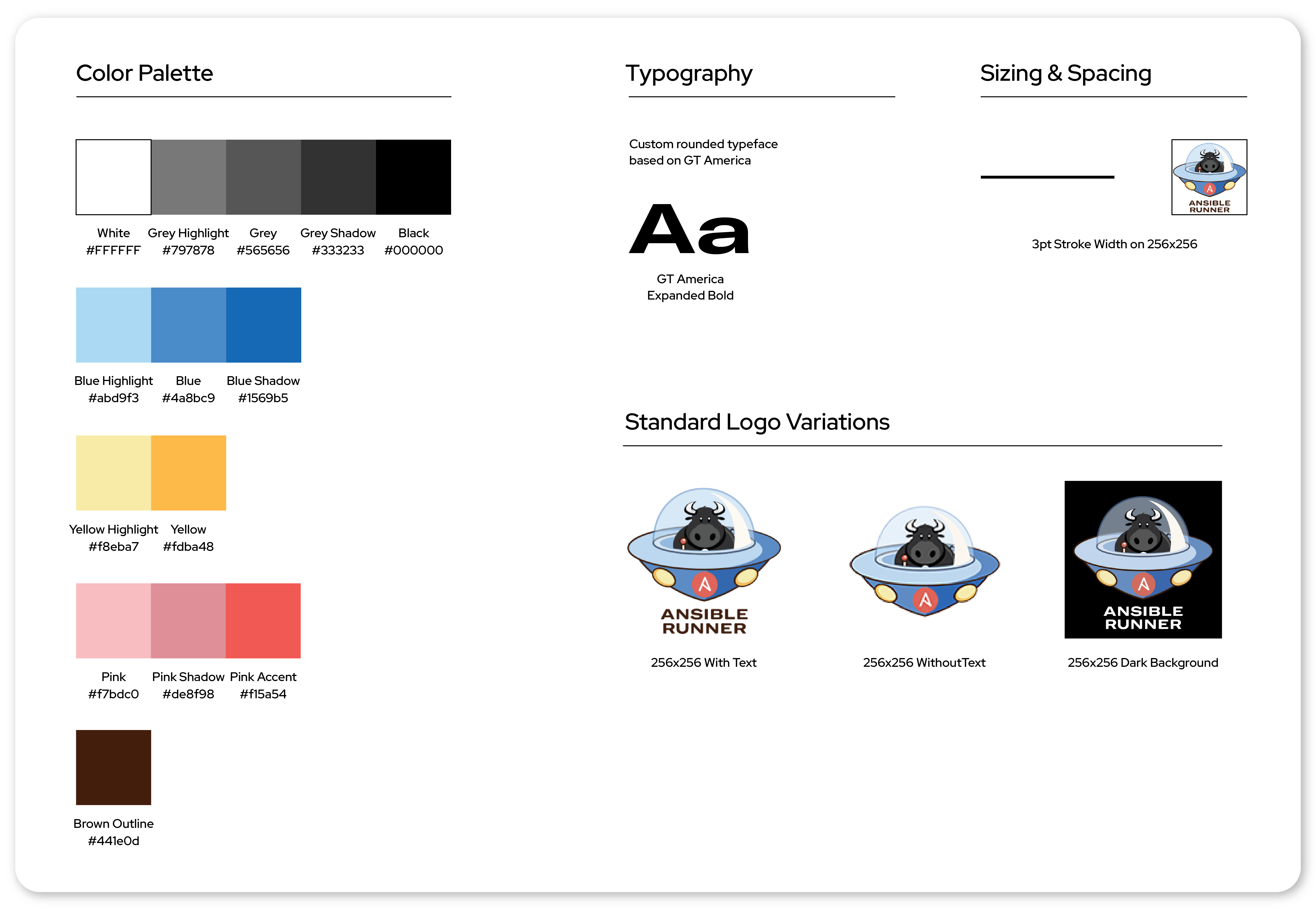
Taking color palette, typography, and imagery into consideration, we generated a consistent composition that features the Ansibull for all core Ansible products, along with bold lines and vibrant colors.
(Fiona Lin and Taufique Rahman, CC BY-SA 4.0)
The new Ansible community logo design style guide details the color palette, typography, sizing, spacing, and logo variations for Ansible product logos.
The new style guide presents a brand new, modern custom typeface based on GT America by Grilli Type, an independent Swiss type foundry. We created a softer look for the typeface to match the imagery's roundedness by rounding out certain corners of each letter.
We decided to curate a more lively, saturated, and universal color palette by incorporating more colors in the spectrum and basing them on primary colors. The new palette features light blue, yellow, and pink, each with a lighter highlight and darker shadow. This broader color scope allows more flexibility within the system and introduces a 3D look and feel.

(Fiona Lin and Taufique Rahman, CC BY-SA 4.0)
We also introduced new imagery, such as the hexagons in the Receptor and AWX logos for visual continuity. Finally, we made sure each logo works on both light and dark backgrounds for maximum flexibility.
Expanding the design portfolio
Once we established the core logo family, we moved onto creating badges for Ansible services, such as Ansible Demo and Ansible Workshop. To differentiate services from products, we decided to enclose service graphics in a circle that contains the name of the service in the same custom typography. The new service badges show the baby Ansibull (from the Ansible Builder logo) completing tasks related to each service, such as pointing to a whiteboard for Ansible Demo or using building tools for Ansible Workshop.

(Fiona Lin and Taufique Rahman, CC BY-SA 4.0)
Using open source for design decisions
The original AWX logo was influenced by rock-and-roll imagery, such as the wings and the heavy metal typeface (omitted from the image here).

(Fiona Lin and Taufique Rahman, CC BY-SA 4.0)
Several members of the Ansible community, including the Red Hat Diversity and Inclusion group, brought to our attention that these elements resemble imagery used by hate groups.
Given the social implications of the original logo's imagery, we had to work quickly with the Ansible community to design a replacement. Instead of working in a silo, as we did for the initial logos, we broadened the project's scope to carefully consider a wider range of stakeholders, including the Ansible community, Red Hat Diversity and Inclusion group, and Red Hat Legal team.
We started brainstorming by reaching out to the Ansible open source community for ideas. One of the Ansible engineers, Rebeccah Hunter, contributed in the sketching phase and later became an embedded part of our design team. Part of the challenge of involving a large group of stakeholders was that we had a variety of ideas for new logo concepts, ranging from an auxiliary cable to a bowl of ramen.
We sketched five community-surfaced logos, each featuring a different branded visual: a sprout, a rocket, a monitor, a bowl of ramen, and an auxiliary cable.

(Fiona Lin and Taufique Rahman, CC BY-SA 4.0)
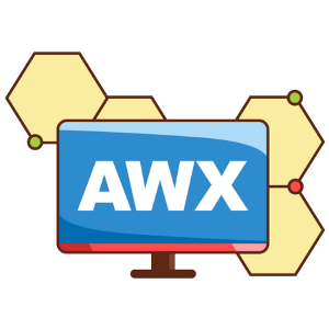
After completing these initial concept sketches, we set up a virtual voting mechanism that we used throughout the iteration process. This voting system allowed us to use community feedback to narrow from five initial concepts down to three: the rocket, the bowl of ramen, and the monitor. We further iterated on these three directions and presented back, via a Slack channel dedicated to this effort, until we landed on one direction, the AWX monitor, that aligned with the community's vision.
(Fiona Lin and Taufique Rahman, CC BY-SA 4.0)
With community voices as our guide, we pursued the monitor logo concept for AWX. We preserved the monitor element from the original logo while modernizing the look and feel to match our updated design system. We used a more vibrant color palette, a cleaner sans-serif typeface, and elements, including the hexagon motif, from the Project Receptor logo.
By engaging with our community from the beginning of the process, we were able to design and iterate in the open with a sense of inclusiveness from all stakeholders. In the end, we felt this was the best approach for replacing a controversial logo. The final version was handed off to the Red Hat Legal team, and after approval, we replaced all current assets with this new logo.
Key takeaways
Creating a set of rules and assets for a design system keeps your digital products consistent across the board, eliminates brand confusion, and enables scalability.
As you explore building a design system with your own community, you may benefit from these key takeaways we learned along our path:
- Scaling new logos with a design system is a much easier process than without one.
- Juggling design options becomes less daunting when you use a polling system to validate results.
- Directing a large audience's attention on sets of three eliminates decision fatigue and focuses community feedback.
We hope this article provides insight into designing a system with an open source community and helps you recognize the benefit of developing a system early in your process. If you are creating a new design system, what questions do you have? And if you have created one, what lessons have you learned? Please share your ideas in the comments.







Comments are closed.