Computers are basically fancy file cabinets, full of folders and files waiting to be referenced, cross-referenced, edited, updated, saved, copied, moved, renamed, and organized. Of course, the files and folders are only virtual, and so software developers came up with the modern "desktop" user interface. Your screen is the top of your "desk," which you can use as a surface for taking out files from their folders so you can review and work on them. The analogy seems almost quaint these days because computers are so much more than just a filing cabinet. And yet the model remains, for many of us, as the primary way we interact with data on our personal computers, which makes humble file manager software some of the most important applications you use.
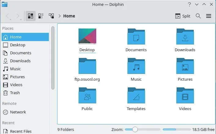
Dolphin on Linux
(Seth Kenlon, CC BY-SA 4.0)
The KDE Plasma Desktop provides Dolphin as its file manager. At first glance, it's a simple and almost minimal application. Don't let that fool you, though. There's a lot of potential in how you interact with the files on your computer, and Dolphin recognizes that. Here are five of my favorite Dolphin features.
1. Fast launches
Dolphin is quick to launch, and I don't mean that Dolphin itself launches quickly, but that the files you use within Dolphin can be opened quickly. A longtime KDE convention is that a single click of the mouse opens a file. That's admittedly counter-intuitive at first. After all, everybody knows you use a single click to select something and a double-click to open. But think about it. When you're selecting something, you're probably engaged in something relatively ponderous. You select files to then do something with them. The act of selection isn't the main action, it's the prep work for the action. There's no immediacy to selection.
But when you open something, you've already made up your mind. You want the file opened so you can start working. There's immediacy to opening a file.
If you look at it that way, it makes sense to require fewer clicks to open a file. So with Dolphin, by default at least, a single click opens a file in its default application. To select a file, you can either click on a Selection button overlaid over the icon, or click and drag to make a group selection. None of this is what you're used to, maybe, and it may seem unnatural, but after you've tried it you won't be able to tolerate a less efficient system.
Faster launch (the other kind)
This isn't a Dolphin feature specifically, but it deserves recognition. Thanks to the kdeinit subsystem of the KDE Plasma Desktop, Dolphin and many other KDE applications benefit from function pre-loading. Essentially, processes are launched by forking and loading a dynamic library containing a ''kdemain()'' function, which gives the typical KDE application a boost to launch time (I haven't timed it myself, but they say it's 2.5 times faster than without) and a reduction in memory consumption.
2. Contextual actions
One of the most basic and most common actions you do with a file manager is move and copy files. In fact, for many people, that's all a file manager is for.
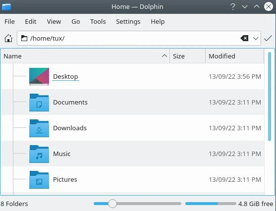
In Dolphin, when you drag-and-drop a file from one place to another, you're given a pop-up contextual menu so you can quickly choose whether you're copying, moving, or symlinking the file. If that slows you down, you can press a modifier key while dragging: Shift to move, Ctrl to copy, or Ctrl+Shift to link. It's fast, efficient, and friendly.
(Seth Kenlon, CC BY-SA 4.0)
3. Power of Qt
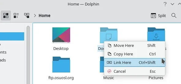
The KDE Framework is based on the Qt framework, a famously flexible graphical toolkit. Not all KDE applications have the opportunity to take advantage of that, but Dolphin has several features that draw upon Qt's modular design. For instance, if you don't like the Places panel on the left of the window, you can move it to the right side of the window, or remove it entirely. Move the toolbar, remove the menu bar and status bar. Qt stops short of letting you redesign Dolphin entirely, but there's enough malleability for you to be able to change its layout to what works best for you.
Here's my personal Dolphin configuration:
(Seth Kenlon, CC BY-SA 4.0)
4. Plugins
Dolphin isn't just Dolphin. It's Dolphin plus any number of plugins you choose to enable. There are plugins for several version control systems, including Git. There are lots of ways to interact with Git, and Dolphin adds one more way for convenience. I don't often think that I'm going to use Dolphin as my Git interface, but with Dolphin version control plugins enabled, it's too easy not to use Dolphin as my Git interface. Nothing could be more natural than adding a file to staging, or adding a commit message, or even pushing to a remote repository, with the file manager that you're using to browse through the files anyway.
5. Options
They're not technically plugins because they're built along with the application, but Dolphin has a staggering number of optional features. You don't have to activate them all at once, but there's plenty of features in Dolphin for you to discover over years of use. For instance, there's an option to show a filter bar, which you can use as a kind of instant find command. You can use tabs in Dolphin, or split the Dolphin window into panes, you can enable expandable folders or choose to click into them, you can open archives as folders, you can choose to view thumbnail previews of certain files or deactivate them for other filetypes, and much more.
Dolphin and the modern Linux desktop
Dolphin, like KDE, thrives on providing you, the user, options, by letting you decide what you want activated and what you want to ignore. Dolphin isn't the minimal lightweight file manager you compile and install on a 10-year old computer you've rescued from the bin (although I've run it as a file manager for Fluxbox on some surprisingly old computers with success), it's the one you feature on your latest PC build. In short, Dolphin is the high tech desktop experience you'd expect from an advanced operating system like Linux. Dive in!







3 Comments