GNOME has a tendency for minimalist design. It's a beautiful desktop experience, and holds the honor of being the first free desktop that's ever elicited vocalized admiration from someone looking over my shoulder as I use Linux. Then again (and pardon the armchair philosophizing), you can't have minimalism without complexity, and KDE is well known for being very customizable. I thought it might be fun to put KDE configuration to the test and try to re-implement, at least superficially, the GNOME experience in the KDE Plasma Desktop.
If you try this, do it in a temporary user account. These changes are relatively drastic, and undoing it to get back to your standard KDE layout can be a lot of work.
Adwaita theme
The default GNOME theme, called Adwaita, was designed for GTK, which is the toolkit GNOME uses for windows and widgets. KDE uses the Qt toolkit, but the Fedora-Qt project has developed a Qt theme that mimics Adwaita. That's the first and most obvious step to mimic GNOME on KDE. Install Adwaita for Qt using your distribution's package manager:
$ sudo dnf install adwaita-qt{,5}
On Debian-based distributions, use the apt command instead of dnf.
Once that's installed, go to System Settings and select Application Style. Select the Adwaita theme variant you prefer: there's a light theme and a dark theme, and variations in between. Click the Apply button to update your theme, but don't close this control panel yet.
Window decoration
Select the Window Decorations category in the left panel of the Application Style window. If there's a title bar style that fits with Adwaita, activate it by selecting it and clicking Apply. If there's no extra decoration installed, click the Get new window decorations button in the bottom right of the panel and download something appropriate. I used the Arc theme by user x-varlesh-x, but you can look around and see what fits best with the rest of your theme.
GNOME famously has just one button on its window title bar, so navigate to the Titlebar Buttons tab and remove all buttons but the Close button by dragging them from the title bar image to the disposal area.
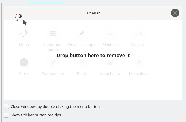
(Seth Kenlon, CC BY-SA 4.0)
Deselect the Show titlebar button tooltips because GNOME doesn't tend to do tooltips over system widgets.
Click Apply to save your changes.
GTK theme
On KDE, applications using GTK are usually re-themed to match KDE's default. Now that you've changed your theme from KDE Breeze to GNOME Adwaita, you have to tell GTK to use the Adwaita theme.
Click the Configure GNOME/GTK application style button at the bottom of the Application style panel and select Adwaita from the drop-down menu.
Workspace behavior
GNOME is visually quieter than KDE, so find the Workspace behavior panel in System Settings and deactivate Display informational tooltips on mouse hover and Display visual feedback for status changes.
You might also change opening files and folders to require a double-click rather than a single-click (in real life. this is a step too far for my liking.)
Icons and cursors
You can change your cursors to the Adwaita theme here in System Settings and then choose an icon theme. I enjoy the Breeze icons but they do feel like KDE. GNOME uses the Adwaita icon set, but because they're designed for GNOME there are missing icons for some important KDE components. You can click the Get New Icons button in the Icons control panel to browse through lots of icon sets, and in the end I chose Nordzy by user alvatip. There are lots of great icon sets available, though, so look through them and see what you like. I found that anything that wasn't Breeze made KDE look sufficiently different from what I was used to.
System panel
The GNOME panel is at the top of the screen, while KDE's panel defaults to the bottom of the screen. GNOME's panel is also a lot emptier by default, so I found it easiest to remove the current KDE panel altogether first.
Right-click on the kicker and select Edit panel. Once in edit mode, right-click on the panel again and select Remove panel. Once it's gone, right-click anywhere on the desktop and select Add panel and add an empty panel. This adds a panel to the bottom of the screen, so right-click on it, select Edit panel, and then click and drag the Screen Edge button to the top of the screen.
While still in edit mode, click the Add widgets button and add the Application dashboard widget to the far left end of the panel. Then add a Spacer block from the Edit panel view, then a Clock, and then another Spacer. You can drag these widgets to arrange them, so I found it easiest to add the application dashboard and clock together, then the two spaces, and then arranged them.

(Seth Kenlon, CC BY-SA 4.0)
You can right-click on each widget to customize icon and layout. For instance, I removed the date from the clock because it looked busy with the date appended, even though GNOME does include the date.
Change the panel to black by going to System Settings and choosing a dark Plasma theme, like Breeze Dark.
GNOME Plasma Desktop
With a few quick adjustments, your desktop now approximates GNOME in a few different ways. The layout is similar.
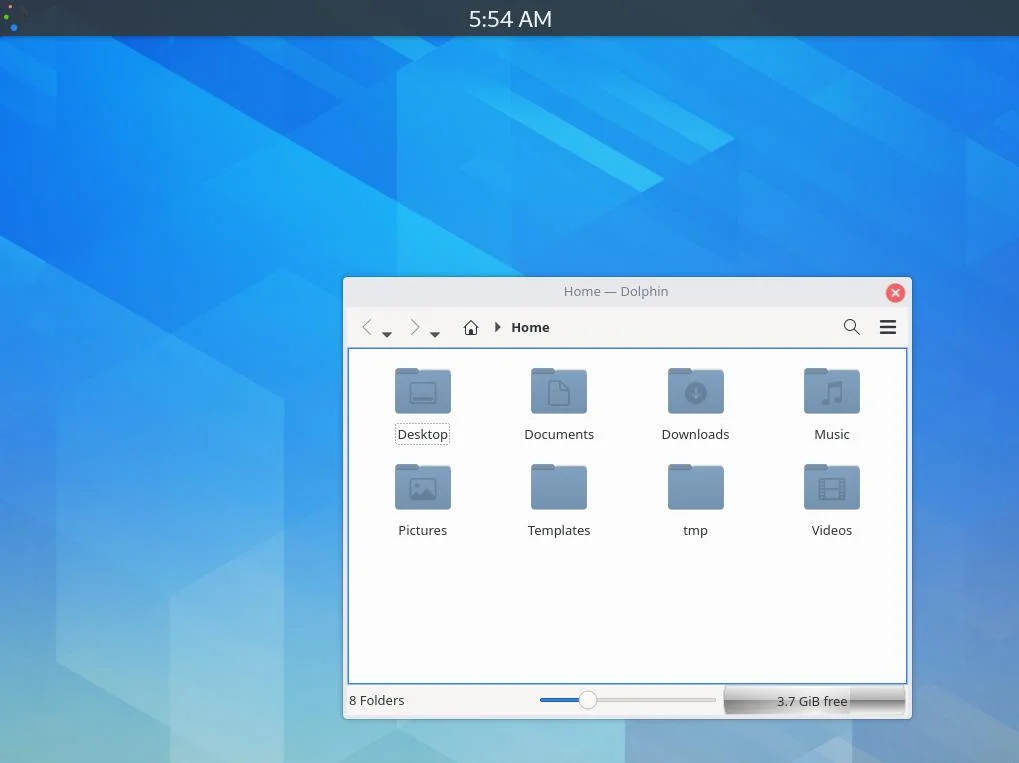
(Seth Kenlon, CC BY-SA 4.0)
The application dashboard provides a GNOME-style application launcher.
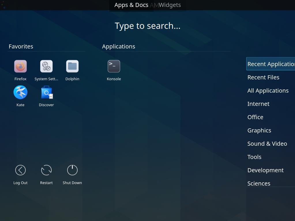
(Seth Kenlon, CC BY-SA 4.0)
Other minor modifications further aid in the illusion. For instance, I simplified the Dolphin file manager by removing the Places panel and by removing most buttons from the toolbar.
A different perspective
It's not an exact match, and someone far more pedantic than I could work harder and get a lot closer to the right results. However, fun changes like this demonstrate just how flexible KDE really is, and how having lots of options means you can pare down what you interact with to fit your preference. A GNOME-like desktop can give you a new perspective on how you interact with your desktop, even if you don't keep the layout forever, and it helps you discover options you may not have thought to look for otherwise.




Comments are closed.