A broad range of enterprises, including nonprofits, media and publishing, government agencies, education, and more, rely heavily on Drupal. But while Drupal is widely recognized as one of the most robust and flexible content management systems (CMS), it also has a reputation for being difficult to work with.
Research conducted at a 2019 DrupalCon suggested that while experienced developers felt empowered and loved working with Drupal, novice users found it challenging to learn and work with. The Drupal community recognized that there was a serious need to improve the ease of use right from the moment you install Drupal.
Since then, several strategic initiatives have been rolled out to make Drupal easier to use and to empower amateur users to build beautiful digital experiences.
Simplifying the out-of-the-box experience
Editorial teams, content creators, marketers, publishers, and tech advisors often use Drupal as an editorial platform. Many of them are beginner to intermediate users. Prioritizing their experience is one of the Drupal community’s top missions.
To get this ball rolling, Dries Buytaert, founder of Drupal, launched the "Easy-out-of-the-box" initiative at DrupalCon 2020. From the onset, the initiative aimed to provide an easy, intuitive, and modern out-of-the-box user experience.
It offers three benefits in one package:
-
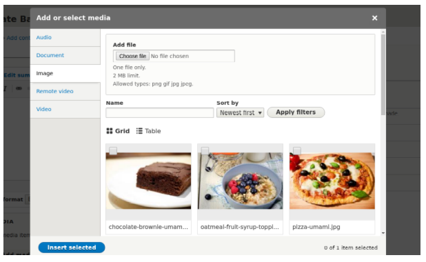
Media library: A flexible and robust digital asset management tool that is easy to work with, even for novice users. Finding, adding, using, deleting, and reusing media files has never been easier. It offers an intuitive interface that is customizable and robust. Media has been a part of Drupal core since the release of Drupal 8.4. The goal now is to have it enabled by default. Work is currently in progress on enhancing Media's usability, design, and accessibility.
Shefali Shetty, CC BY-SA 4.0
-
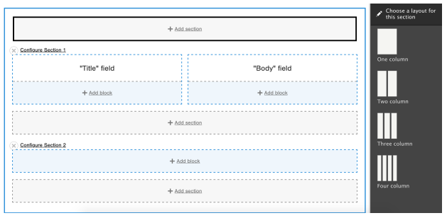
Layout Builder: A WYSIWYG-like experience for editors with easy-to-use page building capabilities. It offers powerful UI tools with intuitive drag-and-drop features that require little or no code to create and customize modern page layouts. Layout Builder has been a stable Drupal core module since Drupal 8.7. Like Media, Layout Builder is not enabled on installation of Drupal. Currently, the initiative team is working towards enabling site builders to layout the headers, footers, and sidebars of the pages as well.
Shefali Shetty, CC BY-SA 4.0
-
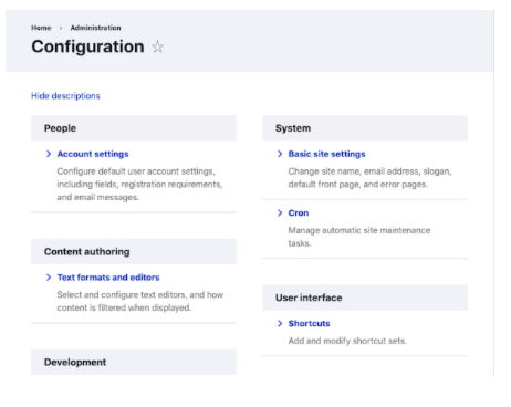
Claro admin theme: This is a fresh, powerful, and accessible administration theme with a modern look and feel. Not only is it easy on the eyes—Claro also offers powerful and advanced visual elements and is compliant with the latest accessibility standards. Currently, Claro is in an experimental phase in Drupal core and is not stable. Before enabling Claro as the default admin theme, more work is needed to enhance its usability, accessibility, and design.
Shefali Shetty, CC BY-SA 4.0
A new front-end theme: Olivero
Bartik, Drupal’s default front-end theme, has been around for more than 10 years. Drupal 8 saw a new release of Bartik that was responsive out of the box and had significant improvements in its structure, extensibility, and design. But ever-evolving web design trends called for a more advanced, modern, and impressive theme. Bartik's design, layout, and functionality feel outdated compared to Drupal's sophisticated backend.
The new front-end theme, Olivero, was named after Rachel Olivero (1982-2019), a Drupal community member and head of the National Federation of the Blind. Olivero is now a stable theme in Drupal 9.3 and will become the default front-end theme with the Drupal 10 release. From an end-user or business owner’s perspective, this new front-end theme presents Drupal as a flexible, modern and a user-friendly blogging platform.
Some of the fantastic features of Olivero:
-
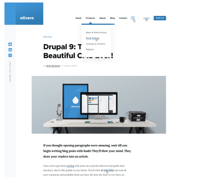
Modern design: The design elements have been built to stay relevant for years to come. The color palette gives the theme a shiny, light, and modern look. Elements like drop shadows and heavy colors are very minimally used. The typography used for body, header, and other UI elements are proportionate and resizable with the device. Buttons are intuitive and come in highly contrasting colors that are easy on the eyes. Collapsible first-level menus make it easy to access even through a lengthy page or on wider screens. Olivero offers tons of customizations in the theme settings to suit every user's needs.
-
Futuristic functionality: Olivero backs Drupal's out-of-the-box multilingual functionality and supports displaying right-to-left (RTL) languages such as Urdu, Arabic, or Hebrew. It is compatible with all the latest browsers without the need to customize code for each of them. The theme will support some of the most useful modules, including Media, Layout Builder, and more. It will also offer and support customizations to secondary navigation. Olivero uses PostCSS to compile CSS and for improved browser support, which also helps a lot when you need further theme customizations.
-
Accessibility: Accessibility has been one of the highest priorities while proposing this theme. Much work has gone into making Olivero compliant with the Web Content Accessibility Guidelines (WCAG) Level AA. The team is continuously working on enhancing the design to get through Drupal's rigorous accessibility gate. The color contrast ratio in Olivero's color palette used in the theme design, typography, forms, messages, and buttons enhances its accessibility.
Shefali Shetty, CC BY-SA 4.0
Project Browser: A module marketplace
Browsing through over 40,000 Drupal modules is not an easy task. In its current setup, if you need to find and install a contributed module, you will need to step out of your Drupal site, head over to Drupal.org, search for the module, and then install it. Often, site builders require more advanced tech skills to install a module via the Composer (a dependency manager for PHP) on a command-line interface.
The Project Browser initiative, proposed by Dries during DrupalCon 2021, seeks to make it easier for site builders new to Drupal to browse and install modules with the click of a button. It will empower developers and site builders to discover and experiment with modules of their choice instantly. To ensure real-time data access, the component will connect to the Drupal.org API using a decoupled approach. The team is actively engaged in:
- Building a marketplace-like browser within Drupal, so you don't have to leave your site looking for modules
- Creating a powerful UI enabling a streamlined view of projects that is easy to filter and sort
- Preparing a minimum viable product (MVP) to be shipped as a contributed feature for users to try out, eventually moving it to Drupal core
The initiative is in its early stages now, but a lot of work has happened already. The team aims to have a contributed module Project Browser ready in Drupal 10.
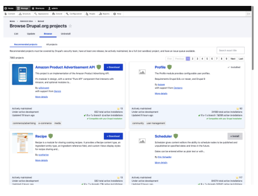
Shefali Shetty, CC BY-SA 4.0
Final thoughts
I have penned my thoughts earlier on how Drupal has been adopting continuous innovation and implementing planned strategic initiatives, as promised. With ease of use and beginner-friendliness as some of Drupal's top priorities, the community is briskly marching towards building an easier, more beautiful, and more modern digital experience platform.
By the way, DrupalCons are a great place to meet, learn, and collaborate with Drupal community members and contribute to advancing the open source platform. If you're looking to connect, DrupalCon Portland 2022 is coming up soon (April 25-28) in Portland, OR, USA.



Comments are closed.