As many of my regular readers will know, I am a big Ubuntu fan. I spent nearly eight years working at Canonical and my love of Ubuntu has not ceased since I left.
One of the fundamental components of Ubuntu is Unity. While Unity ruffled more than a few feathers when it first came out, it has since grown into a comprehensive desktop environment for Ubuntu. Unity is the cornerstone of Canonical's convergence vision in which a single code base can power desktops, phones, tablets, and more.
Right now, though, the Unity story is divided into two pieces. All the exciting new work is going into the next-generation Unity 8. This is where the convergence is happening. Unity 8 is by no means ready yet and is only suitable for tinkerers.
For stable Ubuntu users we have Unity 7. This is the Unity that we know and love in recent Ubuntu releases, and with all the focus going into Unity 8 it's basically in maintenance mode.
Experimentation
The downside of a maintenance mode Unity 7 is that it doesn't introduce many exciting new features—that is all destined for Unity 8. As such, I got the itch to explore what an alternative might look like until Unity 8 is ready for primetime on my desktop. With this in mind, I decided to take a look at GNOME Shell.
Now, I have a pretty good idea of what I want in a desktop environment. I want simplicity, elegance, a lack of clutter, and access to the data both locally and online.
With these needs in mind, I have to say, GNOME really impressed me.
Getting started
To get started I did a fresh install of Ubuntu 15.10, which comes pre-installed with Unity 7. I then installed the GNOME Shell packages, which are version 3.16. These packages integrate nicely with Ubuntu's LightDM login manager and I could select GNOME Shell when logging in. After I had the stock GNOME installed I then went and installed the Ubuntu GNOME PPA, which brings in some newer packages and will ultimately ship 3.18 soon.
The default GNOME Shell experience is pretty good. Access to your applications is simple via the top-left hot corner, which displays the dock and provides a search box for finding specific applications. Multiple workspaces are also easily accessible here.
The indicators on the panel are simple and effective. I was able to connect a range of online accounts to the shell, and it displays calendar events, notifications, and more in the calendar popup.
Performance of GNOME Shell is really good. It feels sleek, quick, and responsive to what I am doing. It also felt rock-solid with no jerkiness, bugs, or awkward visual artifacts. You really get a sense of the quality in the desktop.
What really struck me though was how simple and effective the design is. While many people have been talking about the desktop experience of GNOME, the real innovation and value in my mind is going into the applications. The GNOME community has been trimming down user interface clutter and maximizing screen space. The use of client-side decorations, concise UI, and embedded hamburger-style menus make the apps feel sleek and efficient. This provides a cognitive simplicity that I love.
What surprised me when I really delved into GNOME was how many applications have been written to serve simple and effective use cases. For example, there are calendar, music, videos, documents, and other applications that provide simple and effective solutions for finding and managing content. This is definitely a page taken out of Apple's book, and in a world of increasingly overcomplicated desktop environments GNOME felt refreshing and simple. It actually reminded me of my introduction to GNOME 2 back in the day—I liked how elegance was chosen over complexity.
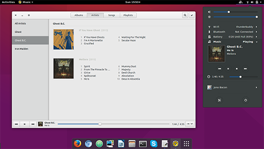
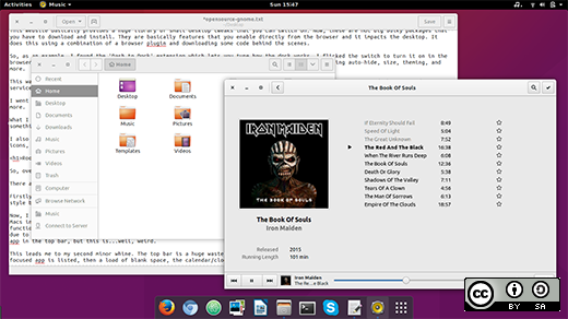
Two good examples of this are gedit and GNOME Music. For the latter, my music needs are simple: browse my artists/albums and play songs. It serves this use case with zero clutter and aggravation. For the former, I just want to write text. Again, the uncluttered user interface and effective use of screen real estate was a joy to use.
Like any new experience though, there were of course some bumps in the road as I got used to this new desktop. It was then that I discovered GNOME Shell Extensions.
Tuning the experience
When I started using GNOME Shell there was one little thing that bugged me. I didn't like how I had to hit the top-left corner to see the launcher/dock. It felt like a clumsy design.
I did a little Google searching and found people asking how to show the dock all the time. This is when someone pointed the questioner to extensions.gnome.org.
This website basically provides a huge library of small desktop tweaks that you can switch on. Now, these are not big bulky packages that you have to download and install. They are basically features that you enable directly from the browser and it impacts the desktop. It does this using a combination of a browser plugin and downloading some code behind the scenes.
So, as an example, I found the "Dash to Dock" extension, which lets you tune how the dock works. I flicked the switch to turn it on in the browser and my dock immediately popped out. Not only that, but there are integrated preferences for tuning auto-hide, size, theming, and more.
This was a revelation to me. Essentially the GNOME community have designed and shipped a sensible default user experience and then created a service in which seemingly anything can be tuned, customized, and hacked into the way you like it. It is the ideal balance of simplicity in defaults that also paves the way to tune it abundantly.
I went on to install extensions for a drop-down terminal, Skype integration, media player integration, alternative alt-tab switching, and more.
What I love about this model is that while defaults are really important, it provides an opportunity for users to make GNOME Shell into something truly theirs. The GNOME community have done a really nice job with how it all fits together.
I also tuned some other elements of my system. I changed my default system fonts to the Ubuntu fonts, switched my theme, enabled desktop icons, and some other tweaks. This effectively turned my computer into an interesting mix of Unity and GNOME; an experience I really like.

Room for improvement
So overall I am loving GNOME Shell, and I love the work that continues to go on in the GNOME community.
However, there are though a few small niggles I still have with it.
Firstly, menu management feels a little awkward right now. While some GNOME apps have removed menus and put them into the hamburger-style button, other apps don't really do this and just display a menu bar in the app.
Now, I know this might be heresy to some of you, but I love the global menu in Unity and on the Mac. I use a mixture of Ubuntu and Macs in my daily work, and the global menu feels so much more space-efficient and simple for me for apps that provide a lot of functionality. I would love to see a global menu extension for GNOME Shell (or even better, built in), but from what I can tell the platform can't support this well due to the way the top bar is laid out. There are some clumsy versions of this where the global menu drops down from the current focused app in the top bar, but this is, well, weird.
This leads me to my second minor whine. The top bar is a huge waste of space. On the left you have "Activities," next to it the currently focused app is listed, then a load of blank space, the calendar/clock, more blank space, and then the indicators.
I feel this design is flawed for a few reasons. Firstly, it wastes a stack of space at the top of my screen. This space could be used for a global menu that could be visible for all applications (even those designed to limit applications in the main window like new GNOME apps do). Secondly, the currently focused app seems rather lost in the top bar. I know I have a bunch of apps open, yet only one is shown in the top bar. This seems awkward, and it seems the only reason to show the app there is to access a menu that could conceivably be available from the quicklist in the dock or in a global menu. Finally, the top bar clumps a bunch of indicators together which seems confusing and doesn't show any legacy indicators at all (e.g. Dropbox or other apps). These legacy indicators use another hot corner that is both undiscoverable and, well, strange.
If I could wave a magic wand in the GNOME project, I would simply model the top bar on the one in Unity but then add Activities to the left. This would provide consistent menu access (as opposed to this odd mix of in-app menu bars and menus buried under a hamburger button). It would keep the indicators to the right and have different indicator icons and thus sub-menus, which fits the mental model of other computer users (e.g. Mac, Windows).
Other than these minor gripes though, I am tremendously impressed with the work of the GNOME community. Many years back I used to spend a lot of time with GNOME folks and they are good people. What is evident here is the passion, focus, and engineering excellence that has gone into building GNOME Shell.
I am excited to see what this incredible community produces next.


13 Comments