Python is full of libraries that can visualize data. One of the more interactive options comes from Pygal, which I consider the library for people who like things to look good. It generates beautiful SVG (Scalable Vector Graphics) files that users can interact with. SVG is a standard format for interactive graphics, and it can lead to rich user experiences with only a few lines of Python.
Using Pygal for stylish Python plots
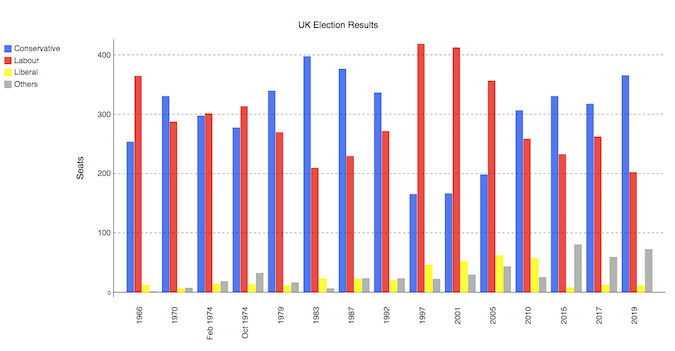
In this introduction, we want to recreate this multi-bar plot, which represents the UK election results from 1966 to 2020:

Before we go further, note that you may need to tune your Python environment to get this code to run, including the following.
- Running a recent version of Python (instructions for Linux, Mac, and Windows)
- Verify you're running a version of Python that works with these libraries
The data is available online and can be imported using pandas:
import pandas as pd
df = pd.read_csv('https://anvil.works/blog/img/plotting-in-python/uk-election-results.csv')
Now we're ready to go. The data looks like this:
        year  conservative  labour  liberal  others
0       1966           253     364       12       1
1       1970           330     287        6       7
2   Feb 1974           297     301       14      18
..       ...           ...     ...      ...     ...
12      2015           330     232        8      80
13      2017           317     262       12      59
14      2019           365     202       11      72
Plotting this in Pygal builds up in a way that I find easy to read. First, we define the style object in a way that will simplify our bar chart definition. Then we pass the custom style along with other metadata to a Bar object:
import pygal
from pygal.style import Style

custom_style = Style(
    colors=('#0343df', '#e50000', '#ffff14', '#929591'),
    font_family='Roboto,Helvetica,Arial,sans-serif',
    background='transparent',
    label_font_size=14,
)

c = pygal.Bar(
    title="UK Election Results",
    style=custom_style,
    y_title='Seats',
    width=1200,
    x_label_rotation=270,
)
Then, we add our data into the Bar object:
c.add('Conservative', df['conservative'])
c.add('Labour', df['labour'])
c.add('Liberal', df['liberal'])
c.add('Others', df['others'])

c.x_labels = df['year']
Finally, we save the plot as an SVG file:
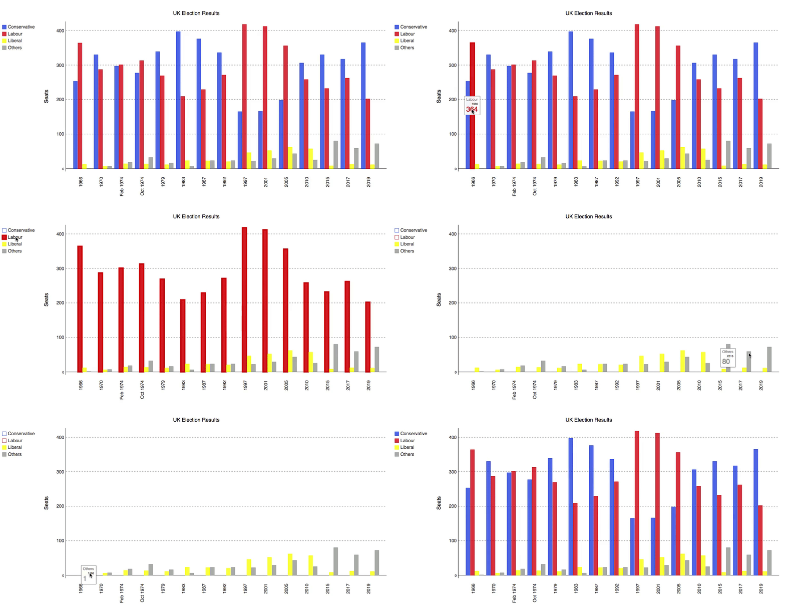
c.render_to_file('pygal.svg')The result is an interactive SVG plot you can see in this gif:

Beautifully simple, and with beautiful results.
Conclusion
Some plotting options in Python require building every object in great detail, and Pygal gives you that functionality from the start. Give Pygal a go if you have data on hand and you want to make a clean, beautiful, and simple plot for user interaction. You can run this code interactively on Anvil (with an account) or locally using this open source runtime.
---
This article is based on Plotting in Pygal on Anvil's blog and is reused with permission.


1 Comment