In this article, I'll discuss the process of creating a user interface for an email client with the help of the free Webix framework. It's a JavaScript and HTML5 framework for developing cross-platform, data-rich web applications with responsive user interfaces. The library is fast, lightweight, and easy to learn. Integration with AngularJS, Vue.js, and jQuery may be pretty handy.
The standard version of this library is distributed under the GNU GPLv3 license.
How Webix works
Let's take a look at how you can start working with Webix. After you've downloaded the package, you should add the required JavaScript and CSS files on the page. You can find them within the codebase folder:
<link rel="stylesheet" href="https://opensource.com/codebase/webix.css" type="text/css">
<script src="https://opensource.com/codebase/webix.js" type="text/javascript"></script>

Now you can start creating something useful:

webix.ready(function(){
  webix.ui({
      /* app definition */
  });
});
It's not required to use webix.ready in your apps, but it helps to ensure that your code is executed after the page is fully loaded (as an alternative to the onDocumentReady event and onlload() method).
To add a widget on your page, you should use the view property. Its value defines what widget will be used. Using additional properties, you can define how this widget will look and work. For example, to create a chart:
webix.ready(function(){
  webix.ui({
    /* we need a chart */
    view: "chart",
    /* within this container */
    container:"my_chart",
    /* of this type */
    type: "bar",
    /* here's the data for our chart */
    data: sales,
    /* more properties*/
  });
});
To add more than one widget on the page, you have to create a layout. I'll talk about it in the practical part of this article.
Creating the email client
To understand better how Webix works and what you can get using it, you'll create a user interface for the email client. This is how it will look:
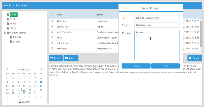
Because Webix is a fully client-side framework that can be integrated with any back end, you'll concentrate only on the user interface.
Step 1: Layout creation
Before adding any components in your app, you have to define its layout. The Layout component allows dividing the page into rows and columns. You can create nested rows and columns, set their relative or absolute size, or give your users the possibility to change the size of created cells manually.
The best thing about the Layout component is that the created page layout is a bunch of DIV containers so that you can use any third-party component alongside the Webix widgets.
Let's take a look at how everything works. If you want to create an app that consists of three rows, you can use the following code:
webix.ui({
    rows:[
        { /* 1st row components */ },
        { /* 2nd row components */ },
        { /* 3rd row components */ }
    ]
});
To create a three-column layout, you can use almost the same code. All you need to do is to replace rows with columns:
webix.ui({
    cols:[
        { /* 1st column components */ },
        { /* 2nd column components */ },
        { /* 3rd column components */ }
    ]
});
Looks pretty easy, huh? Let's proceed with a more complex example: nested cells. Here's how you can get them:
webix.ui({
    rows:[
        { /* 1st row components */ },
        { /* 2nd row components */ },
        /* 3rd row consists of two columns */
        { cols:[
            { /* 1st column components */ },
            { /* 2nd column components */ },
        ]}
    ]
});
The result is shown below:
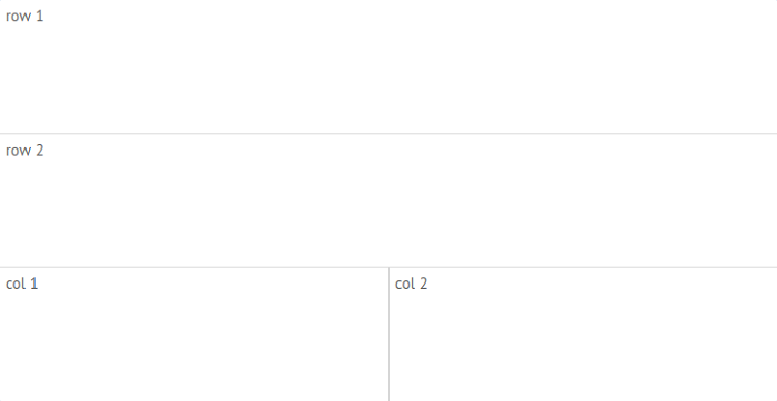
Using different combinations of nested rows and columns, you can create as complex layout as your project requires. Using Resizer you can make one of the cell borders draggable, so a user will be able to resize it manually.
Combining everything that you've learned so far, you can create a layout for your email client. You'll use the Template component for adding labels to every cell, so you won't forget which component you're going to put there lately. The template allows for the of a rendering a plain text or a single data record.
This is the required code:
webix.ui({
    type: "space",
    rows:[
        /* 1st row. Toolbar */
        {
            template: "Toolbar",
            height: 45,
        },
        /* 2nd row. The rest of application */
        {
            type:"wide", cols:[
                /* 1st column of the second row.
                /* Folder tree and Calendar */
                {
                type: "clean",
                    rows:[
                        {
                            template: "Tree",
                            width: 280
                        },
                        {
                            template: "Calendar"
                        }
                    ]
                },
                /* 2nd column of the second row.
                /* Email list, Buttons, and Message reader */
                { type:"wide",rows:[
                    { template: "Email List" },
                    { height: 45, cols:[
                        { template: "Button1" },
                        { template: "Button2" },
                        {},
                        { template: "Button 3" }
                    ]},
                    { template: "Message" }
                ]}
            ]
        }
    ]
});
As you can see, you've used the height and width properties to define the required size. The new property here is type. It defines the layout borders.
If you use the clean value, you'll get cells without borders. Using the wide value, you'll get cells with borders and large spaces between siblings.
Let's check the results:
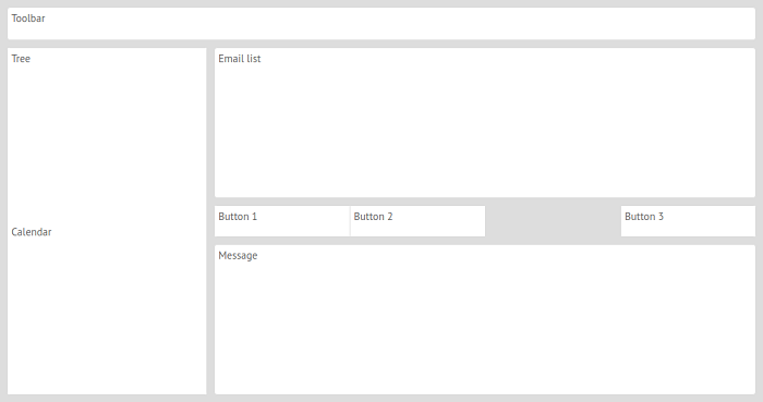
This looks promising. Your task now is to replace the templates with actual components.
Step 2: Adding the toolbar
Let's start with the Toolbar component. It can contain various elements such as buttons or drop-down menus.
As you remember, to create a component using Webix, you have to use the view: "component_name" code line. The elements property allows choosing the content of our toolbar.
Let's add a label to your app, so every user would know what he or she is dealing with:
{
    view: "toolbar",
    height: 45,
    elements:[
        {view: "label",
        label: "My Email Manager"}
    ]
},
Now you have to add this code to the app. You have to replace the previously created template with your code.
Before:
webix.ui({
    rows:[
        /* 1st row. Tollbar */
        {
            template: "Toolbar",
            height: 45,
        },
        /* 2nd row. The rest of application */
        {
            type:"wide", cols:[
        < ... >
});After:
webix.ui({
    rows:[
        /* 1st row. Tollbar */
        {
            view: "toolbar",
            height: 45,
            elements:[
                {view: "label",
                label: "My Email Manager"}
            ]
        };
        /* 2nd row. The rest of application */
        {
            type:"wide", cols:[
        < ... >
});
Let's check the results:
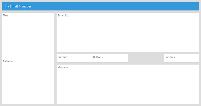
This looks better, so let's move forward. If you want to add more elements on your toolbar, you can check the following documentation page.
Step 3: Adding the folder tree
You'll use the Tree widget for this task. The data property defines the structure of your folder tree.
Here's the code:
{
  view:"tree",
  id: "my_tree",
  select: true,
  width:280,
  data:[
    { id:"1", value:"Inbox"},
    { id:"2", value:"Sent"},
    { id:"3", value:"Drafts"},
    { id:"4", value:"Trash"},
    { id:"5", value:"Contact Groups", open:true, data:[
      { id:"5-1", value:"Friends"},
      { id:"5-2", value:"Family"}
    ]
    }
  ]
};
Every tree node has a unique ID and a value that will be displayed on the screen. The Contact Groups node has two subnodes.
The open: true property will open this branch. Besides the described properties, pay attention to this code line: select: true. It allows selecting the tree items. Now you can replace the template: "Tree" with this code.
Let's check the results:
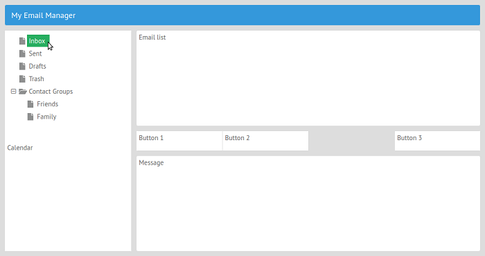
Everything works as it should.
Step 4: Adding the calendar
Now you can add a calendar with the time picker to your app. This handy interactive widget provides the possibility to pick the necessary time and date when you want to fill a form or create a new event. This widget was used for the creation of the GanttPRO app that allows users to work with online Gantt charts:
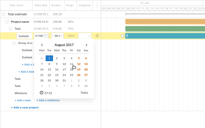
It won't be a hard task:
{
    view:"calendar",
    timepicker:true
}
After you replace template: "Calendar" with this code, you'll get the following result:
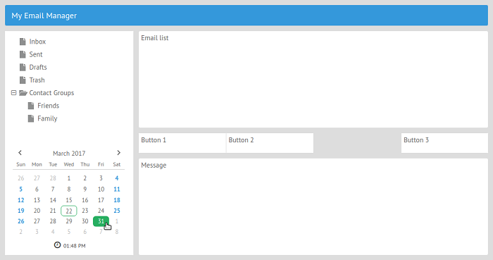
Step 5: Using the DataTable component for showing the list of emails
You're now warmed up from adding pretty simple components to your app, so you can proceed with something more complex.
You'll use the DataTable component to display the list of emails. It's an advanced data component that supports many features, such as filtering, sorting, pagination, etc. It supports different formats such as XML, JSON, and CSV. As an example of how this highly configurable component works within the real web app, take a look at XL Reporting, a tool that simplifies financial reporting:
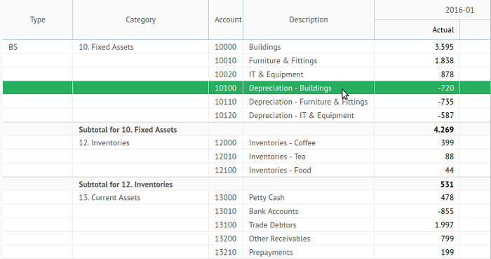
For this example, you'll use a JSON object as a data source:
var data = [
        {id:1, folder:1, name: "Alex Stern",
         email: "alex@spam.com", subject:"Invitation",
         date: "25/07/2016 12:30:20"},

        {id:2, folder:1, name: "Sofia O'Neal",
         email: "sofia@spam.com", subject:"Report",
         date: "25/07/2016 16:10:07"},

        /* more info here */
        {id:11, folder:2, name: "Alex Stern",
         email: "alex@spam.com", subject:"Re: Forecast",
         date: "25/07/2016 14:10:45"},

        {id:12, folder:2, name: "Sofia O'Neal",
         email: "sofia@spam.com", subject:"Party invitation",
         date: "25/07/2016 17:05:10"}
    ];
As you can see, the list of emails will contain such information as name, email address, subject, and date.
Notice that you have also used the folder property. Its value determines in which folder a particular email is stored. In your case folder: 1 means that an email is stored within the Inbox folder. The folder: 2 property tells Webix that an email is stored within the Sent folder. Later you'll learn how to make your app show only those emails that are related to the selected folder.
Now you can create a new DataTable component:
{
    view:"datatable",
    data: data,
    scrollX:false,
    columns:[
        /* checkboxes with the master checkbox in the header */
        { id:"checked", header:{ content:"masterCheckbox" },
          template:"{common.checkbox()}", width: 40 },
        { id:"name", width: 250, header:"From" },
        { id:"subject", header:"Subject", fillspace:true },
        { id:"date", header:"Date", width: 150 }
    ]
},
The scrollX: false code line disables the horizontal scroll bar. The columns property defines which columns your table will have. The first column contains only checkboxes. The header:{ content:"masterCheckbox" } defines the header with the master checkbox that can be used to select all the available emails. Using template:"{common.checkbox()}" you can add a checkbox to every cell of this column.
Other columns simply display the info from the data source. The value of the id property defines what data will be displayed in a column (name, subject, and date). The header property adds a text to the header. Pay attention to the fillspace:true property. You've used it to force the column to widen for filling unused space.
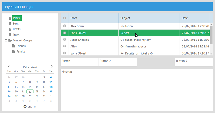
Now, replace template: "Email list" with the above code and you'll get something like this:
Step 6: Using data binding
Now you have to write some code that will help Tree and DataTable work together.
As you remember, the data array that you've used during the DataTable creation contains emails from two different folders: Inbox and Sent. Your task is to make the DataTable component display the proper emails according to the selected folder. To do it, you can use the mechanism called Data Binding.
Data binding is implemented with the bind() function. Is should be called from the slave component and take a master component as a parameter. Since you want your DataTable to change its content according to the selected node of the Tree, the first component will be the slave, and the second one will be the master.
Besides binding data, you have to tell your app that the first node of the tree should be selected after the app is loaded. To reach the goal, you should place the corresponding code inside of the ready method as it's shown below:
webix.ready(function(){
    webix.ui({
        /* UI Definition */
    });

    /* data binding */
    $$("my_datatable").bind($$("my_tree"),function(obj,filter){
        return obj.folder == filter.id;
    });
    /* making the first node of the tree selected */
    $$("my_tree").select(1);

});
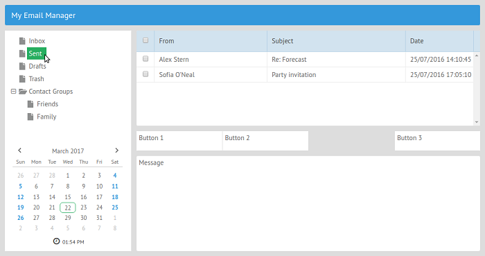
Now, the content of the email list will be changed according to the selected folder:
Step 7: Adding the buttons
This won't be a hard task because you've already learned the properties required for creating the components. You have to create three buttons: Reply, Create, and Delete.
Here's the code you should use:
{
  view:"button",
  label:"Reply",
  width: 95
};

{
  view:"button",
  label:"Create",
  width: 95
};

{
  view:"button",
  label:"Delete",
  width: 95
};
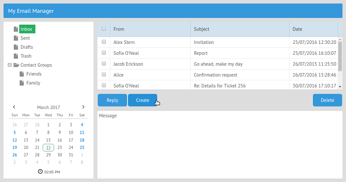
After replacing the templates with the actual code, you'll get this:
It may be difficult for a user to find the right button among the others. To simplify this task, you can add icons to your buttons.
Webix uses icons from the Font Awesome collection. These icons are licensed under the MIT License, and there's plenty from which to choose.
To turn a regular button into a button with an icon, you have to add two properties:
- Type will define which kind of button you'll use
- Icon allows choosing the proper button from the collection
For example, if you want to add an icon of an envelope to the Create button, you can use the following combination of properties:
type: "iconButton",
icon:"envelope"
Using the same approach, you can add icons to all your buttons:

Step 8: Displaying the email content
Because the body of the email is presented by the HTML code, you can use the Template component for displaying it. Replace the template: "Message" code with the following:
id:"details",
template:"No message selected"
If there are no selected emails, a user will see the following message: No message selected. You can manipulate this component using the value of its id property. For example, you have a variable that contains the message:
var message = "Lorem ipsum dolor sit amet";To render this message on the screen, you can use the following code:
$$("details").define("template",message);
$$("details").render();
Step 9. Using the Windows
The last step is to provide the possibility to create new messages. You'll use the Window component for this task.
You already have the Create button but it does nothing. Let's change it:
view:"button",
label:"Create",
type: "iconButton",
icon:"envelope",
width: 95,
/* event listener */
click:function(){
  $$("my_win").getBody().clear();
  $$("my_win").show();
}
Next, after a user clicks this button, Webix will show a window that has the id: "my_win" property on the screen. This window will contain a form for sending a new email. Before showing it, you have to remove previously inserted data from it. That's why you've used the clear() method.
Now, you'll define how this window will look like. For this task you have to use a new webix.ui() constructor:
webix.ui({
      view:"window",
      /* movable window */
      move: true,
      id:"my_win",
      width:400,
      /* window title */
      head:"New Message",
      position: "center",
      body: {
          /* there will be a form here */
      }
});
The move property allows enabling the possibility to move the window. Using the head property, you can define the window's title. The position: "center" code line tells Webix that the new window should appear in the center of the page. The body section may contain any view. In your case, it'll be a form.
Step 10: Adding a form to the window
The Form widget helps to create web forms with minimum effort.
Let's check the following example:
view:"form",
/* hide the borders */
borderless:true,
/* form controls */
elements: [
  { view:"text", label:'To:', name:"address" },
  { view:"text", label:'Subject:', name:"subject" },
  { view:"textarea", height:200, label:"Message:",
    name:"message"},
  { cols: [
    { view:"button", value: "Send"},
    { view:"button", value: "Close",
      click:("$$('my_win').hide();") }
  ]},
],
The borderless property allows hiding the form's borders. The most important part of the form is the elements property. It defines an array of vertically arranged controls and control groups.
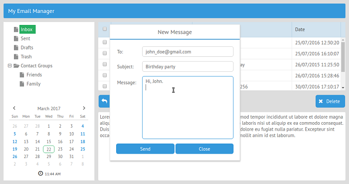
In your case, the form will consist of two text fields, one text area, and two buttons: Send and Close. Notice that the Close button uses the hide() method for closing the window. The Send button does nothing because your example doesn't have the back-end part. In a real application using the click property, you can add the code that will send the message.
After you've added the code that creates the form to the window code, you can test the results. Click the Create button, and a new window will appear on the screen:
Wrapping up
With Webix, you can create user interfaces for web applications with minimum efforts. Using the Layout component, you can build complex layouts pretty fast. The ease of use allows you to experiment in creating different variants of mockups to decide which component placement will guarantee better user experience.
All you need to do to add one of the available data components on the page is to define which one you're going to use and set a data source for it. After that, you can proceed with the configuration process until you to reach the desirable result.




4 Comments