11 reasons to use the GNOME 3 desktop environment for Linux

The GNOME 3 desktop was designed with the goals of being simple, easy to access, and reliable. GNOME's popularity attests to the achievement of those goals.
830 readers like this.
GNOME

Gunnar Wortmann via Pixabay. Modified by Opensource.com. CC BY-SA 4.0.

Late last year, an upgrade to Fedora 25 caused issues with the new version of KDE Plasma that made it difficult for me to get any work done. So I decided to try other Linux desktop environments for two reasons. First, I needed to get my work done. Second, having been using KDE exclusively for many years, I thought it might be time to try some different desktops.

The first alternate desktop I tried for several weeks was Cinnamon which I wrote about in January, and then I wrote about LXDE which I used for about eight weeks and I have found many things about it that I like. I have used GNOME 3 for a few weeks to research this article.

Like almost everything else in the cyberworld, GNOME is an acronym; it stands for GNU Network Object Model. The GNOME 3 desktop was designed with the goals of being simple, easy to access, and reliable. GNOME's popularity attests to the achievement of those goals.

GNOME 3 is useful in environments where lots of screen real-estate is needed. That means both large screens with high resolution, and minimizing the amount of space needed by the desktop widgets, panels, and icons to allow access to tasks like launching new programs. The GNOME project has a set of Human Interface Guidelines (HIG) that are used to define the GNOME philosophy for how humans should interface with the computer.

My eleven reasons for using GNOME 3

  1. Choice: GNOME is available in many forms on some distributions like my personal favorite, Fedora. The login options for your desktop of choice are GNOME Classic, GNOME on Xorg, GNOME, and GNOME (Wayland). On the surface, these all look the same once they are launched but they use different X servers or are built with different toolkits. Wayland provides more functionality for the little niceties of the desktop such as kinetic scrolling, drag-and-drop, and paste with middle click.

  2. Getting started tutorial: The getting started tutorial is displayed the first time a user logs into the desktop. It shows how to perform common tasks and provides a link to more extensive help. The tutorial is also easily accessible after it is dismissed on first boot so it can be accessed at any time. It is very simple and straightforward and provides users new to GNOME an easy and obvious starting point. To return to the tutorial later, click on Activities, then click on the square of nine dots which displays the applications. Then find and click on the life preserver icon labeled, Help.

  3. Clean desktop: With a minimalist approach to a desktop environment in order to reduce clutter, GNOME is designed to present only the minimum necessary to have a functional environment. You should see only the top bar (yes, that is what it is called) and all else is hidden until needed. The intention is to allow the user to focus on the task at hand and to minimize the distractions caused by other stuff on the desktop.

  4. The top bar: The top bar is always the place to start, no matter what you want to do. You can launch applications, log out, power off, start or stop the network, and more. This makes life simple when you want to do anything. Aside from the current application, the top bar is usually the only other object on the desktop.

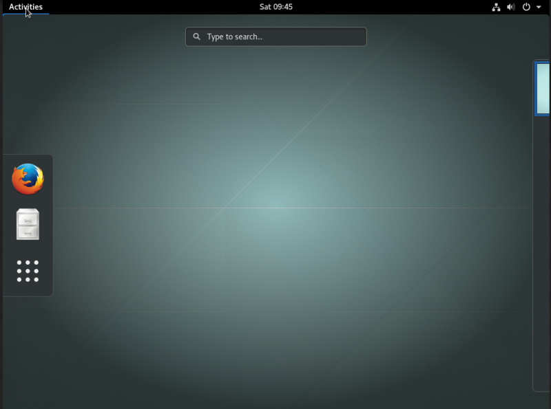
  5. The dash: The dash contains three icons by default, as shown below. As you start using applications, they are added to the dash so that your most frequently used applications are displayed there. You can also add application icons to the dash yourself from the application viewer.
    gnome_fig_2.png

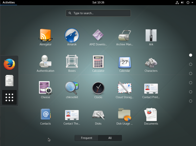
  6. Application viewer: I really like the application viewer that is accessible from the vertical bar on the left side of the GNOME desktop,, above. The GNOME desktop normally has nothing on it unless there is a running program so you must click on the Activities selection on the top bar, click on the square consisting of nine dots at the bottom of the dash, which is the icon for the viewer.
    gnome_fig_1.png

    The viewer itself is a matrix consisting of the icons of the installed applications as shown above. There is a pair of mutually exclusive buttons below the matrix, Frequent and All. By default, the application viewer shows all installed applications. Click on the Frequent button and it shows only the applications used most frequently. Scroll up and down to locate the application you want to launch. The applications are displayed in alphabetical order by name.

    The GNOME website and the built-in help have more detail on the viewer.

  7. Application ready notifications: GNOME has a neat notifier that appears at top of screen when the window for a newly launched app is open and ready. Simply click on the notification to switch to that window. This saved me some time compared to searching for the newly opened application window on some other desktops.

  8. Application display: In order to access a different running application that is not visible you click on the activity menu. This displays all of the running applications in a matrix on the desktop. Click on the desired application to bring it to the foreground. Although the current application is displayed in the Top Bar, other running applications are not.

  9. Minimal window decorations: Open windows on the desktop are also quite simple. The only button apparent on the title bar is the "X" button to close a window. All other functions such as minimize, maximize, move to another desktop, and so on, are accessible with a right-click on the title bar.

  10. New desktops are automatically created: New empty desktops created automatically when the next empty one down is used. This means that there will always be one empty desktop and available when needed. All of the other desktops I have used allow you to set the number of desktops while the desktop is active, too, but it must be done manually using the system settings.

  11. Compatibility: As with all of the other desktops I have used, applications created for other desktops will work correctly on GNOME. This is one of the features that has made it possible for me to test all of these desktops so that I can write about them.

Final thoughts

GNOME is a desktop unlike any other I have used. Its prime directive is "simplicity." Everything else takes a back seat to simplicity and ease of use. It takes very little time to learn how to use GNOME if you start with the getting started tutorial. That does not mean that GNOME is deficient in any way. It is a powerful and flexible desktop that stays out of the way at all times.

David Both
David Both is an Open Source Software and GNU/Linux advocate, trainer, writer, and speaker. He has been working with Linux and Open Source Software since 1996 and with computers since 1969. He is a strong proponent of and evangelist for the "Linux Philosophy for System Administrators."

19 Comments

Nobody in his right mind tries to use KDE on a Red Hat product -- unless he's masochistic. Alternatively, if you want to use GNOME one needs look no further than Red Hat.

Not sure about that. I used to use Mandrake/Mandriva and it was an excellent RedHat based KDE distro. Even Fedora is mostly OK with KDE. It's not ideal but it mostly works.

In reply to by Chuck Davis (not verified)

Yeah, I remember how much I liked Mandrake when I was playing with it almost a decade and a half ago... It was so polished compared to many other big distros.

In reply to by nelu

It is funny, because Linus Torvalds is using KDE on fedora...

In reply to by Chuck Davis (not verified)

I started using KDE on RHEL 5 because I was getting frustrated with GNOME. As with many choices, a lot of it comes down to personal preference.

In reply to by Chuck Davis (not verified)

i3 may not be a DE but it's fast, simple, lightweight and what I use when KDE is too buggy or resource-heavy. Far easier to build the latest i3 than GNOME on distros without the latest version in their official repos.

How about mentioning the great extensions?

Gnome is a good desktop environment but between Gnome, KDE and Xfce I find Gnome the heaviest. While the difference may not be drastic on newer systems, on my older systems (I think 7+ years old at the youngest) small differences can be noticeable.

KDE surprised me when I tried Neon and it clocked in around 700MB idle. More than Xfce but less than Gnome (both by ~ 200MB). More significantly the lag in how long actions take is more significant with Gnome. I can use a stopwatch to time how long it takes for the Dash to open, with animations off. I don't get the same slow-down in the other environments.

Gnome does, however, have a lot of positive features and feels comfortable. I prefer a number of GTK applications over their Qt equivalent and the idea of features such as Online Accounts.

Gnome definitely benefits from the breadth of extensions available from helpful utility to fun add -on.

I look forwards to seeing what the folks at Ubuntu bring into the fold for Gnome.

Most of the listed "reasons" are actually not reasons, it's mostly PR. Let me know when Gnome offers sane configuration choices. I don't have a problem with simplicity, but I do have a problem with simplicity forced on me. I want to be able to configure this thing if I wanted to. Simplicity can easily be achieved with sane defaults backed by configuration choice. Also many configuration goals can be achieved by plugins (glorified by another commenter here) but why do the Gnome devs make it so complicated to achieve basic configuration goals? Why do I have to remember esoteric key combinations in order to execute the most basic functions?

Clean desktop? The default layout of KDE presents just one taskbar at the bottom which is fully functional. It is "cleaner" than the screenshot in your article.
Also, I never see more than 300-400MB of memory usage on first boot of KDE (5.9.x or greater). Seems this is not a relevant argument anymore. Besides it feels as snappy as any other desktop.
Most objections against KDE are historical, IMO, and latest iterations are nothing short of awesome in terms of looks and functionality.

Great article ... as a long-time GNOME user, I can fully relate =)
However, just small point ... I'm pretty sure Application Overview shows Frequent apps by default.

I just love Gnome 3.

My whole familly uses it, and even our grandmother loves it ;)))

My best user desktop experience ever. And I tried may systems in last 30 years ...

Out of the box, Cinnamon was pretty clean and easy to use for me. I can't stand Gnome 3, it's to simplistic like Unity for Ubuntu became.

Personally, I just like how easily Gnome installs on vanilla Debian, and works well out of the box. For VMs and slower boxes, I still prefer LXDE. Gnome just happens to work fine for what I use my main box for. I barely see my desktop with all the programs open anyway, and I usually hit the windows menu key and either click a shortcut or type the first few letters of the program I need. Since I can do that on most DEs, these "wars" are largely irrelevant to me.

Vi! Vim! Nano! Pico! Latex! Emacs!

Opinions. The same as trying to scream out which type of coffee is best...

I will state very clearly that I began to hate Gnome after 1.4.6. - utter lack of ability to customise it to my liking - and then the chaotic nature of all the mixed GTK libraries...ARGH!

That being said, I shunned Gnome for years. "Gee! No me!" was my fave phrase - up until recently.

I believe in functionality. "Eye candy" is all nice and fine and dandy for some, but for me, I just want something that works. And keeps working. And continues to work after updates/upgrades. (Like WindowMaker?)

I've used nearly all "window manglers" and "desktop environmental disasters" - as curiosity and progress bait me...

That being the case, in the past two years, very little has impressed me...and I can only speak for ME, no one else. I continuously go back to my beloved "WindowMaker" because it's consistent, stable, albeit "mystical" in some respects. Gnome 3 - or the 3.22 "recent release" - actually DID impress me...enough to cause me to actually "chuck it all in" and install the whole "kit'n'kaboodle". Gnome-shell extensions and the whole "whoo-ha". I haven't done THAT in a long time...(since Enlightenment DR17).

Impressed.

I've even tested it on absolute "n00bs". Very little to show, and "whoosh!" - they're off. THAT impressed me even more.

It's obviously NOT perfect, and will continue to "progress"...but I *am* extremely gobsmacked at where it's come - especially in knowing it's past and the progression from there to here - now.

Ergonomically sensible, practical and logical. Clean. Configurable and easy to customise. Very little "hiccup" in any sense. Switching applications and desktops - easy peasey. Which I do quite often. I still can't believe that I'm this impressed with it.

Again, however, it's all on preference. "Fanboys" will hate - as is the nature of the beast - and rant about everything else on the planet. That's fine. That's FREEDOM. And it's nice.

I laud the Gnome team for their efforts and for what has finally come. I'm thankful and grateful for all the time and energy - and thought - that have been poured into this project.

If you've not played with it, please, by all means, do so. Give it a shot. For "n00bs", I'm now highly recommending this (for first-time linux users) as the first "desktop environment" to test.

Peace.

Have been using Gnome since I first installed Fedora. I have never seen a desktop environment do EVERYTHING as well as it does! Kudos to the developers, and I hope it never goes the way of Canonical!....LoL!

"Application display: In order to access a different running application that is not visible you click on the activity menu. This displays all of the running applications in a matrix on the desktop. Click on the desired application to bring it to the foreground. Although the current application is displayed in the Top Bar, other running applications are not."

That sounds hideous. I usually have dozens of applications running simultaneously that I need to constantly switch back and forth between. If I have to move the mouse all the way to the left, click on the activity menu, then click on a "matrix".... I've already died of frustration...

I use MATE, for one very simple reason: I work with 2 huge monitors, the desktop seamlessly spanning both. With MATE I get the nice old school functionality of having a task/menu bar running the length of each monitor, displaying all the apps that are visible *on that monitor*. It's intuitive, it's simple, it makes perfect sense. Look slightly down, see the relevant running app button, click it, look slightly up again - there's the app.

Can GNOME3 do that?

Gnome makes it unnecessarily difficult to move the dash to the bottom of the screen Mac-style. It ought to be a "right-click" option built into the dash itself.

I use a weak GNOME and have some problems, 1. sharing lan to wireless dont workind (on kde it works weary well), 2. right click to great a text file not working, (there is only new folder). But an other way it is stabile then kde. Now I use Atheros Arch Gnome, before used KDe on Fedora, Manjaro but there are many bugs. Kde have a very good function, it is kdeconnect. very good function. It's all. Thank you.

Creative Commons LicenseThis work is licensed under a Creative Commons Attribution-Share Alike 4.0 International License.