I first installed Linux in 1993. At that time, you really didn't have many options for installing the operating system. In those early days, many people simply copied a running image from someone else. Then someone had the neat idea to create a "distribution" of Linux that let you customize what software you wanted to install. That was the Softlanding Linux System (SLS) and my first introduction to Linux.
My '386 PC didn't have much memory, but it was enough. SLS 1.03 required 2MB of memory to run, or 4MB if you wanted to compile programs. If you wanted to run the X Window System, you needed a whopping 8MB of memory. And my PC had just enough memory to run X.
As I'd grown up with the command line, a graphical user interface wasn't essential to me. But it sure was convenient. I could run applications in different windows and easily switch between tasks.
From my first experiment with Linux, I was hooked. I've stuck with Linux on my desktop ever since. Like many people, I ran Linux in a dual-boot configuration for a while so I could jump back to MS-DOS and Windows to run certain programs. Until 1998, when I finally took the plunge and went all-in with Linux.
Over the last 26 years, I have watched the Linux desktop mature. I've also tried an interesting combination of desktop environments over that time, which I'll share by taking a journey through the history of the Linux desktop.
X and window managers
The first "desktops" on Linux weren't yet desktops. Instead, they were window managers running on the X Window System. X provided the basic building blocks for a graphical user interface, such as creating windows on the screen and providing keyboard and mouse input. By itself, X didn't do much. To make the X graphical environment useful, you needed a way to manage all the windows in your session. That's where the window manager came in. Running an X program like xterm or xclock opens that program in a window. The window manager keeps track of windows and does basic housekeeping, such as letting you move windows around and minimize them. The rest is up to you. You could launch programs when X started by listing them in the ~/.xinitrc file, but usually, you'd run new programs from an xterm.
The most common window manager in 1993 was TWM, which dates back to 1988. TWM was quite simple and provided only basic window management.
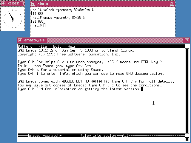
TWM on SLS 1.05 showing xterm, xclock, and the emacs editor
Yet another early window manager was the OpenLook Virtual Window Manager (OLVWM). OpenLook was a graphical user interface developed by Sun Microsystems in the 1980s and later ported to other Unix platforms. As a virtual window manager, OLVWM supported multiple workspaces.
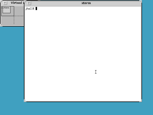
OLVWM on SLS 1.05 showing xterm and the virtual workspaces selector
When Linux began to grow in popularity, it didn't take long for others to create new window managers with smoother performance and improved interfaces. The first of these new window managers was FVWM, a virtual window manager. FVWM sported a more modern look than TWM or OLVWM. But we didn't yet have a desktop.
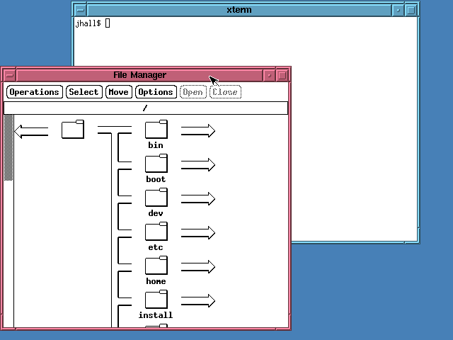
FVWM on SLS 1.05 showing xterm and a file manager
To modern eyes, TWM and FVWM may look pretty plain. But it's important to remember what other graphical environments looked like at the time. The then-current version of Windows looked rather simple. Windows versions 1 through 3 used a plain launcher called the Program Manager.
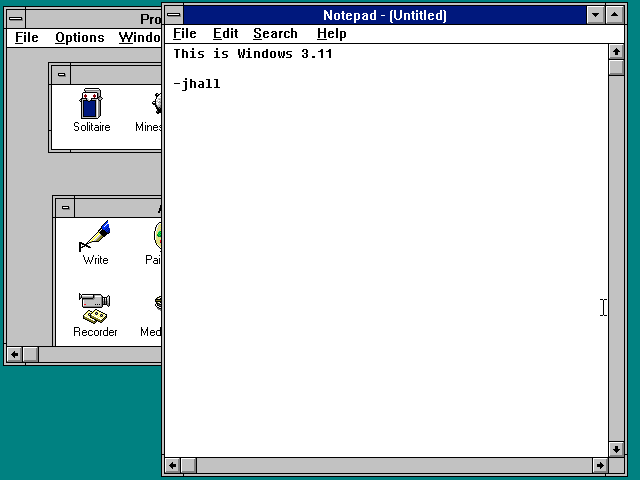
Windows 3.11 showing the Program Manager and the Notepad editor
In August 1995, Microsoft released Windows 95 and changed the modern PC desktop landscape. Certainly, I was impressed. I thought Windows 3.x was ungainly and ugly, but Windows 95 was smooth and pretty. More importantly, Windows 95 was what we now consider a desktop. The new desktop metaphor was a huge step forward. You could put icons on the desktop—and in fact, Windows 95 presented two default desktop icons, for My Computer (to open a file manager) and the Recycle Bin (where you put files to be deleted later).
But more importantly, the Windows 95 desktop meant integration. The Program Manager was gone, replaced by a Taskbar at the bottom of the screen that let you launch new programs using a simpler Start menu. The Taskbar was multifunctional and also showed your running programs via a series of buttons and a dock showing the time, speaker volume, and other simple controls. You could right-click on any object on the new desktop, and Windows 95 would present you with a context-sensitive menu with actions you could perform.
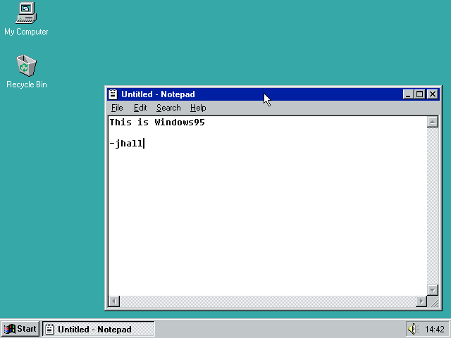
Windows 95 showing the Notepad editor
The Windows 95 interface was slick and much easier to use than previous versions of Windows—and even other Linux window managers. Not to be outdone, Linux developers created a new version of FVWM that mimicked the Windows 95 interface. Called FVWM95, the new window manager still wasn't a desktop, but it looked very nice. The new taskbar let you start new X programs using the Start menu. The taskbar also showed your running programs using buttons similar to Windows 95's.
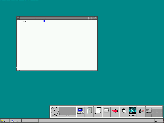
FVWM95 on Red Hat Linux 5.2 showing xterm and a quick-access program launcher with icons for xterm, the file manager, and other programs
While FVWM95 and other window managers were improving, the core problem remained: Linux didn't really have a desktop. It had a collection of window managers, and that was about it. Linux applications that used a graphical user interface (GUI, pretty much meaning they were X applications) all looked different and worked differently. You couldn't copy and paste from one application to another, except the simple text-only copy/paste provided by the X Window System. What Linux really needed was a complete redo in its GUI to create the first desktop.
The first Linux desktop
In 1996, Matthias Ettrich was troubled by the inconsistency of Linux applications under X. He wanted to make the graphical environment easy to use. And more importantly, he wanted to make everything integrated—like an actual desktop.
Matthias started work on the K Desktop Environment. That's K for "Kool." But the name KDE was also meant to be a play on the Common Desktop Environment (CDE) that was the standard in the "Big Unix" world. Although by 1996, CDE was looking pretty dated. CDE was based on the Motif widget set, which is the same design that FVWM mimicked. Finalized in July 1998, KDE 1.0 was a definite improvement over plain window managers like FVWM95.
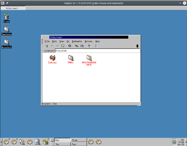
K Desktop Environment (KDE) version 1.0
KDE was a big step forward for Linux. Finally, Linux had a true desktop with application integration and more modern desktop icons. KDE's design was not dissimilar from Windows 95. You had a kind-of taskbar along the bottom of the screen that provided the equivalent of Windows 95's Start menu as well as several application shortcuts. KDE also supported virtual desktops, which were cleverly labeled One, Two, Three, and Four. Running applications were represented via buttons in a separate taskbar at the top of the screen.
But not everyone was happy with KDE. To abstract the GUI from the system, KDE used Trolltech's Qt toolkit library. Unfortunately, Qt was not distributed under a free software license. Trolltech allowed Qt to be used at no charge in free software applications but charged a fee to use it in commercial or proprietary applications. And that dichotomy is not aligned with free software. This caused problems for Linux distributions: Should they include KDE? Or default to an older but free software graphical user interface like FVWM?
In response, Miguel de Icaza and Federico Mena started work in 1997 on a new Linux desktop. The new project was dubbed GNOME, for GNU Network Object Model Environment. GNOME aimed to be completely free software and used a different toolkit, called GTK, from the GIMP image editor. GTK literally stood for GIMP Tool Kit. When GNOME 1.0 was finally released in 1999, Linux had another modern desktop environment.
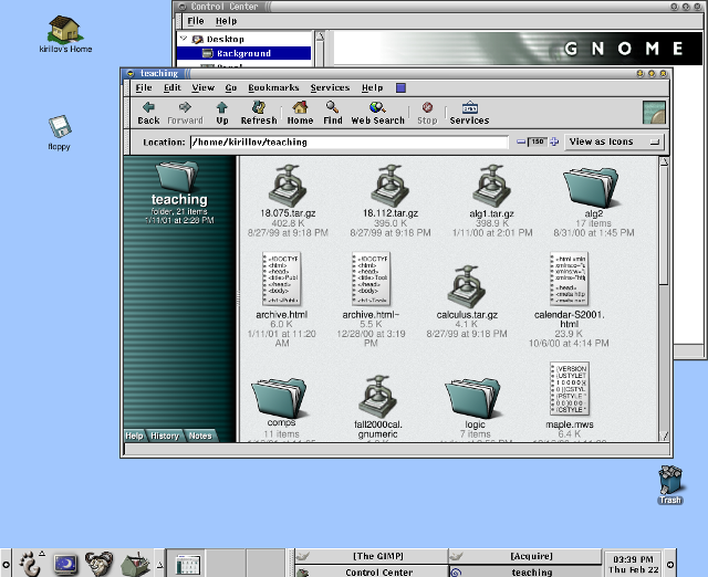
GNOME version 1.0
While it was great to have two desktop environments for Linux, the "KDE versus GNOME" rivalry continued for some time. By 1999, Trolltech re-released the Qt library under a new public license, the Q Public License (QPL). But the new license carried its own baggage—the QPL only applied to Qt's use in open source software projects, not commercial projects. Thus the Free Software Foundation deemed the QPL not compatible with the GNU General Public License (GNU GPL). This licensing issue would remain until Trolltech re-re-released the Qt library under the GNU GPL version 2 in 2000.
Development over time
The Linux desktop continued to mature. KDE and GNOME settled into a friendly competition that pushed both to add new features and to exchange ideas and concepts. By 2004, both GNOME and KDE had made significant strides, yet brought only incremental changes to the user interface.
KDE 2 and 3 continued to rely on a taskbar concept at the bottom of the screen but incorporated the buttons for running applications. One of KDE's most visible changes was the addition of the Konqueror browser, which first appeared in KDE 2.
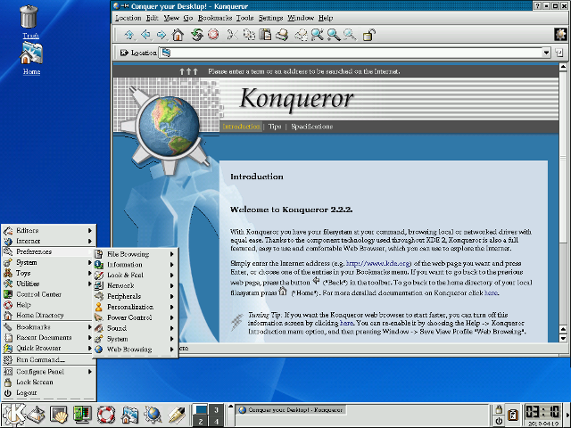
KDE 2.2.2 (2001) showing the Konqueror browser
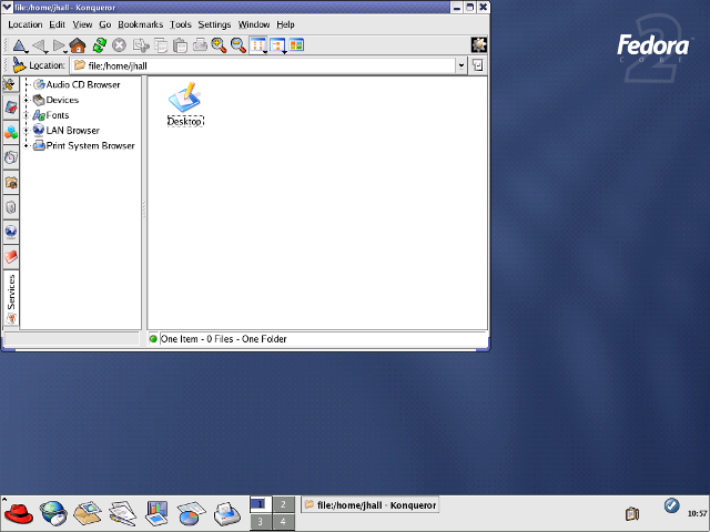
KDE 3.2.2 (2004) on Fedora Core 2 showing the Konqueror file manager (using a Fedora Core 2 theme)
GNOME 2 also used a taskbar concept but split the bar into two: a taskbar at the top of the screen to launch applications and respond to desktop alerts, and a taskbar at the bottom of the page to show running applications. On my own, I referred to the two taskbars as "things you can do" (top) and "things are you doing" (bottom). In addition to the streamlined user interface, GNOME also added an updated file manager called Nautilus, developed by Eazel.
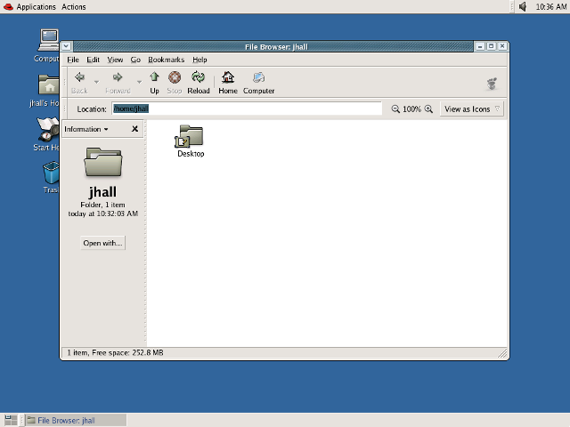
GNOME 2.6.0 (2004) on Fedora Core 2 showing the Nautilus file manager (using a Fedora Core 2 theme)
Over time, KDE and GNOME have taken different paths. Both provide a feature-rich, robust, and modern desktop environment—but with different user interface goals. In 2011, there was a major deviation between how GNOME and KDE approached the desktop interface. KDE 4.6 (January 2011) and KDE 4.7 (July 2011) provided a more traditional desktop metaphor while continuing to rely on the taskbar concept familiar to many users. Of course, KDE saw lots of changes under the hood, but the familiar look and feel remained.
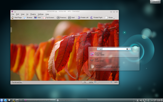
KDE 4.6 showing the Gwenview image viewer
In 2011, GNOME completely changed gears with a new desktop concept. GNOME 3 aimed to create a simpler, more streamlined desktop experience, allowing users to focus on what they were working on. The taskbar disappeared, replaced by a black status bar at the top of the screen that included volume and network controls, displayed the time and battery status, and allowed users to launch new programs via a redesigned menu.
The menu was the most dramatic change. Clicking the Activities menu or moving the mouse into the Activities "hot corner" showed all open applications as separate windows. Users could also click an Applications tab from the Overview to start a new program. The Overview also provided an integrated search function.
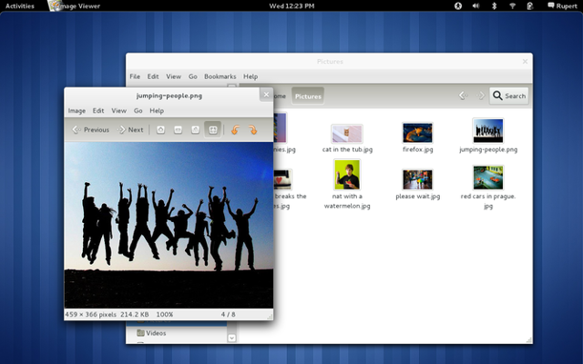
GNOME 3.0 showing the GNOME Pictures application
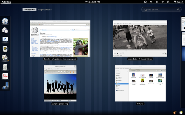
GNOME 3.0 showing the Activities Overview
Your choice of desktop
Having two desktops for Linux means users have great choice. Some prefer KDE and others like GNOME. That's fine. Pick the desktop that best suits you.
To be sure, both KDE and GNOME have fans and detractors. For example, GNOME received a fair bit of criticism for dropping the taskbar in favor of the Activities Overview. Perhaps the most well-known critic was Linus Torvalds, who loudly denounced and abandoned the new GNOME as an "unholy mess" in 2011—before moving back to GNOME two years later.
Others have made similar criticisms of GNOME 3, to the point that some developers forked the GNOME 2 source code to create the MATE desktop. MATE (which stands for MATE Advanced Traditional Environment) continues the traditional taskbar interface from GNOME 2.
Regardless, there's no doubt that the two most popular Linux desktops today are KDE and GNOME. Their current versions are both very mature and packed with features. Both KDE 5.16 (2019) and GNOME 3.32 (2019) try to simplify and streamline the Linux desktop experience—but in different ways. GNOME 3.32 continues to aim for a minimal appearance, removing all distracting user interface elements so users can focus on their applications and work. KDE 5.16 takes a more familiar approach with the taskbar but has added other visual improvements and flair, especially around improved widget handling and icons.
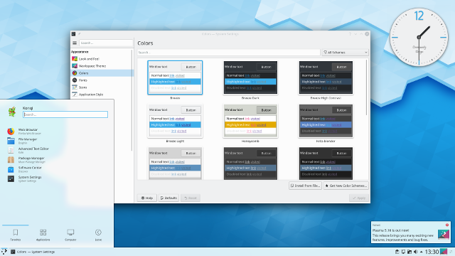
KDE 5.16 Plasma
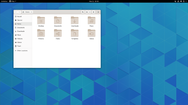
GNOME 3.32
At the same time, you don't completely lose out on compatibility. Every major Linux distribution provides compatibility libraries, so you can run applications from, say, KDE while running GNOME. This is immensely useful when an application you really want to use is written for the other desktop environment—not a problem; you can run KDE applications on GNOME and vice versa.
I don't see this changing anytime soon. And I think that's a good thing. Healthy competition between KDE and GNOME has allowed developers in both camps to push the envelope. Whether you use KDE or GNOME, you have a modern desktop with great integration. And above all, this means Linux has the best feature in free software: choice.





10 Comments