Poll: What do you think of the save icon?

When you think about saving your work, what iconography comes to mind? Is it still the floppy diskette, or something more contemporary? Take our poll.
47 readers like this.
How old is your oldest Linux install disk?

Blude. CC BY 2.0.

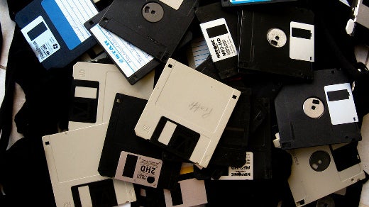
Ok, I have just been doing some writing – something I do a lot of – and for some strange reason, I actually paid attention to the icon that stands for “Save.” It is – what?? – a diskette!! Why? How long has it been since diskettes were actually used? And how would the young people coming into computing even know what a diskette is?

I still have a few old diskettes around and even an external USB diskette drive – just in case – but it has been over a decade since I used it. And that was to convert some very old WordPerfect files into ODT format for LibreOffice. I no longer even install CD/DVD devices in my computers anymore because everything I need is downloadable.

Not all “save” icons are a diskette. Some icon sets use other images, but the diskette seems to be the most common. So is there something else that might be universally recognized as an icon for “save?”

Take our poll and tell us whether the diskette icon should be replaced with something more modern.

What to read next
David Both
David Both is an Open Source Software and GNU/Linux advocate, trainer, writer, and speaker. He has been working with Linux and Open Source Software since 1996 and with computers since 1969. He is a strong proponent of and evangelist for the "Linux Philosophy for System Administrators."

13 Comments

I grew up using floppies. Still have a bunch gathering dust somewhere, like old memories. For sure, it is an antiquated icon, even comically so. Its only virtue is that it's widely used & so people get used to it (and that it makes gaffers reminisce). But that *is* a virtue, however mild, so I wouldn't replace it unless the new icon was clearly better. A down arrow could mean download. A checkmark could mean a lot of things, like, "OK, I'm done now." Am SD card is probably the best modern update b/c it, like the floppy, is removable media. But removable media is arguably an odd image of something more likely to be saved to internal media like a hard drive. It's an interesting question!

I voted for the diskette. It's terribly anachronistic, but everybody seems to know what it means and it's a distinctive shape.

A hard drive might be a good replacement, but computers don't (generally) use them anymore either. And an SSD doesn't look like anything in particular.

The real problem is that people don't generally use removable storage at all, so there's no immediately familiar image to represent storage. For saving to a network server, the cloud icon (maybe with an arrow) can work, but that fails miserably for local storage.

Of course, if you follow Apple's UI choices, then the entire concept of "save" is an anachronism. Their apps auto-save everything, offering you options to duplicate a document (in lieu of save-as) or to revert contents to some prior state (usually as the document was when it was last opened). That makes discussion about a save icon moot, but it introduces questions about what these other icons should look like, if they will appear on a tool-bar.

It's hard to come up with something more recognizable than a floppy icon. Sigil's isn't too bad -- it's a curving arrow over a rectangular grey blob (I guess it's supposed to be a drive of some sort).
A number of apps don't use any icon - you have to choose Save from the menu.

I agree! No one under 30 recognizes it as a floppy disk. It is just some funny-looking square that means "Save." Users have been forced to learn the meaning of an icon. But the icon is supposed to be obvious in its meaning.

The "Save" icon needs an update. We need to change the "Save" icon to be meaningful to a variety of users, not just those that grew up with the older technology.

"No one under 30 recognizes it as a floppy disk."
Nonsense. There are plenty of us.

In reply to by Jim Hall

Another icon cound be a file folder with a down arrow pointing to inside it.

I can agree that the floppy disk is dated and that it's not wrong to look for a replacement icon. I would just ask that it not be the downward arrow. It is a current and valid icon for "download". There have been several attempts to blur the line between cloud and local. I consider calling it "download" when you are saving local data to local storage to be a particularly awful example.

Firefox and a few other bits of software I used seem to be favouring the down arrow to me "Save" or "Download" so I reckon that works moving forward.

I like the floppy disk but at this point it's become the "save" icon or symbol rather than anything more meaningful for newer computer users.

I came along using floppies as the 'Save' icon.I can't think of any really good options for saving. Maybe just a button with 'Save' on it.

I voted the floppy disk. After all, the letter "a" is thought to have originated from a pictogram of an ox's head (oxen being a popular tradable commodity back in the day). We're still using it though!

going further back in time... what about a scroll?

I like the idea, but I think many computer systems (including Windows) uses a scroll icon to represent an executable script.

A right-pointing arrow (maybe left-pointing for users using right-to-left languages) pointing at an image of a computer would work. The problem then is trying to think of an icon everybody will recognize as a computer. A picture of a mini-tower, laptop or phone (for mobile apps) might work.

If your GUI includes a generic "computer" icon, overlaying that with an arrow is not a bad idea. And then the icon will change if the user skins the UI to customize the computer icon (e.g. to make it look like the model running the app).

In reply to by David B. (not verified)

Creative Commons LicenseThis work is licensed under a Creative Commons Attribution-Share Alike 4.0 International License.