At the Open Technology Institute (OTI), we've been working on opening our user feedback process as a way to improve our internal processes and collaboration, engage our user community more, promote non-developer contributions, and think more broadly about how open source process plays a role in the Commotion Wireless project, a free and open-source communication tool that uses mobile phones, computers, and other wireless devices to create decentralized mesh networks.
More on that in my previous article.
In this article, I've expanded on the five tips I've identified for leveraging user-centered design in your open source project.
1. Track usability and design issues.
- Gather context as well as feedback
- Don't respond (with software/design changes) to each piece of feedback
- Synthesize issues for themes
As a result of our field activities, we had a pretty large queue of feedback from trainers, trainees, and users on documentation, usability and design, feedback from hackathons, the developer and discussion mailing lists, as well as a tracker for issues that people submit via the website. Given the amount of feedback we had gathered over the last few years, we decided to start by synthesizing and categorizing the themes in that dataset.
Understanding user feedback can be very challenging. Many developers and designers hear feedback or read notes from a user feedback session, and want to make changes to the user interface based on each comment a user makes. What a user says exactly is not always the change that you need to make—it's important to understand the context in which the user provided the feedback. We've run into this a few times on the Commotion project, as much of our feedback comes from hands-on training sessions with novice users.
The main problem here is that it becomes difficult to understand if the feedback is on the documentation that the user is following, something confusing in the interface design or a mismatch between the documentation and the interface. Understanding the context and the user motivations and goals, and documenting that with the actual feedback—observational or commentary—is crucial for assessing the feedback later. Not to mention that it makes it possible for other team members to understand the context without having been present.
2. Understand who you want to design for.
When making design decisions, you often have to prioritize which type of user to design for—novice or expert users. Our goal with the Commotion project is that anyone should be able to set up a mesh network, which would push us in the direction of designing for novice users.
The challenge is that in network administration and management, users will frequently and sometimes very quickly need access to the more advanced settings and configuration tools. Striking the balance between novice usability and expert access can be challenging, and it's important here to remember that each round of usability improvements is just that - the current round or iteration. You might not be able to fix everything this time, and you might not have even found all of the issues to fix.
The important thing is that you focus on keeping it simple and learnable to allow novice users to find their way around and expert users the ability or doors to get to the features they know they need.
3. Make prototypes.
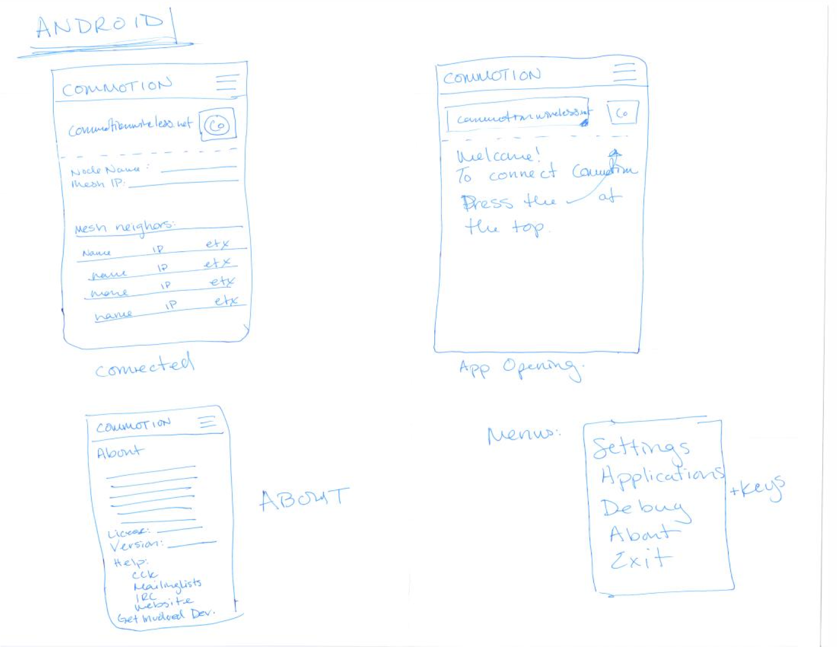
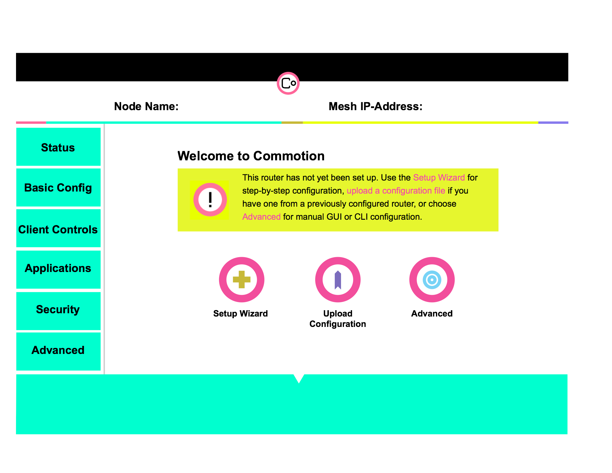
Leverage the style of the prototype (low-fidelity vs high-fidelity) to get the type of feedback you need.
 Low-fidelity prototype of Commotion Android

High-fidelity prototype of Commotion Router Setup Wizard
Similar to the issue I described earlier about understanding the context surrounding the user feedback, it's important to understand the context you are creating with your prototypes. High-fidelity prototypes or mockups are a great way to get detailed design/visual feedback from users—e.g. about colors, language, placement of buttons, etc. High-fidelity prototypes are not a good way to get feedback about the logical process flow—e.g. does your software match users' mental models of how the software should work?
The basic rule of thumb here is that the sketchier (literally more sketch-like) your prototypes are—the more likely the feedback will be about information structure and process flow—i.e. challenging your basic design assumptions, whereas the more detailed the prototypes are the less likely the user is to challenge it because they have a sense that you've already finished and so focus on the aesthetic issues. The type of prototype you make should be based on the type of feedback that you need.
4. Understand how the software works from the user's perspective.
The next step of the process for us was to reach out to user groups—some whom we had trained and some who had adopted the software on their own to have them do a walkthrough of the prototypes. We looked for novice users as well as expert users to make sure that the changes we were making wouldn't break anyone's mental models of the software and to make sure that we were burying any tools that needed to be top level in the interface. We scheduled as many users as we had time to work with, and used screen sharing software to walk through some standard tasks using Commotion.
To do this, we prepared a plan for our interactions with the user community, asking them to Think Aloud through some of the common tasks such as configuring a wireless router, checking on the network status, finding out how many users are currently connected, and things like that. We also had some standard "demographic" questions to get a sense of the user's context, such as their familiarity with the software and with managing networks, what type of network they were involved in, their role within the network, and what type of operating systems and technology they use most often. All of this information can help your team in building better user profiles or personas and can feed into more informed design processes for new features down the line.
5. Use usability/design iterations to build your community: hackathons, mailing lists, and distributed tools.
Similar to what the Magnolia CMS team described in their post about designing for mobile versus desktop, it’s important to be open and transparent about the usability review and design process as it can help you engage your broader community. This means cultivating conversations on mailing lists, encouraging constructive criticism of UX and design, or even asking current members to recruit others that work in UX to the project.
For the Commotion team, this was just one iteration of what has been and will continue to be many improvements to the user interface, but it gave us a chance to practice our process, catch up on a backlog of user interface issues, and work on developing our community. It also gave us an opportunity to show the community the many ways that they contribute to the process, aside from just contributing code. We’re making sure that whenever we go to a hackathon, we have our documentation ready to be hacked on along side our software, website, and everything else, so that we can keep making it better and easier to use.
View the complete collection of Women in Open Source Week articles.


2 Comments