In animation, there's an old saying that animation is easy, it's the tweening that's hard. In traditional animation practices established in the 1920s, key frames are drawn by a lead artist, and staff artists draw the in-between frames. This is called inbetweening, or "tweening" for short. Today, computers are often recruited for the work of inbetweening. In the words of Tony DeRose, of Pixar:
...That's exactly how our animators work. They pose body parts and facial expressions at "key" frames they feel are important, and then our animation system software uses mathematical functions called splines to create the inbetween poses...
That's why animation is (relatively) easy with Synfig Studio. As the animator, you only have to account for an element at the start and at the end of its movement. Synfig calculates everything else.
Synfig is a useful tool for solo animators who don't have a team of assistants to handle their inbetween frames, for users who don't consider themselves illustrators but still need movement in a graphic for a movie or presentation, and users who are confident in their illustration skills but want to focus on animation technique. I once worked on splash screens and motion backgrounds, which are those graphic sequences you see in TV spots and news programs, and I often surprised myself at how quickly they came together in Synfig. I'd create a few graphics, get the color scheme right, set two key frames, and the job's done. It really is as easy as that. Give it a try.
Synfig interface
At its most basic, the Synfig interface is divided into four parts:
- Canvas, where your animation is displayed
- Timeline, where frames are recorded
- Tools
- Properties, where you make adjustments to the components of your animation
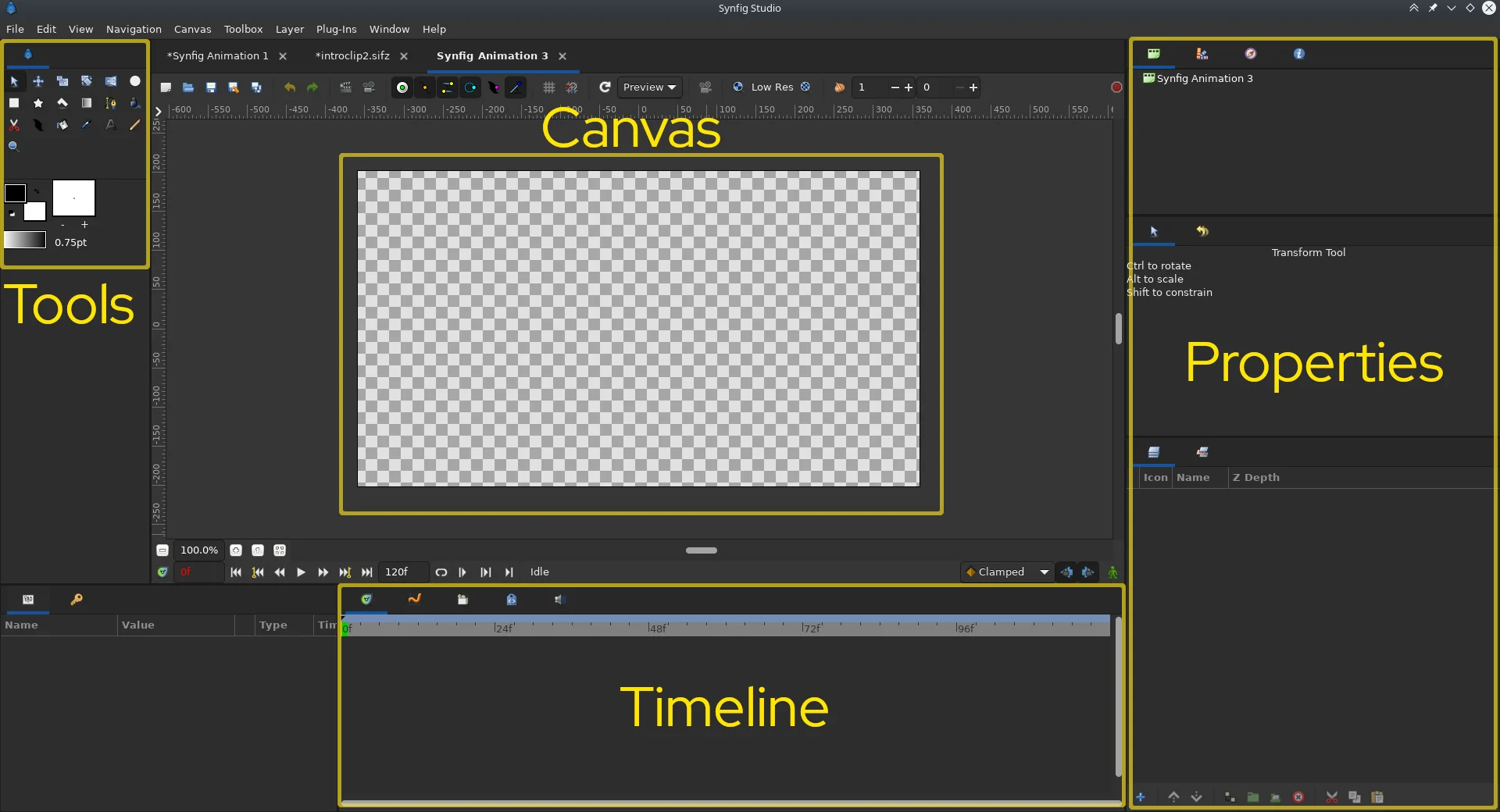
(Seth Kenlon, CC BY-SA 4.0)
The basics of animation don't seem to change much, so the process is similar regardless of what application you're using.
Draw your assets
Drawing in Synfig is an art in itself because how you draw for fun and how you draw for computer animation are different processes. You can draw instead in Inkscape or Krita (and, to circle back around, you can also animate in Krita), but it's better to start with what Synfig gives you so that you understand how Synfig uses the assets you provide. I think of it as cut-paper animation, except that the paper is digital, and so you have all the special effects that working with digital graphics brings along with it.
Imagine that you're creating an overlay for a news program. The clock face needs to be transparent so the video editor can place it over shots of news reporters for the intro sequence.
To begin with, draw a circle using the Circle tool. Activate the Circle tool by clicking on the icon in the toolbox on the left, or press E on your keyboard. Click and drag on your canvas to create a circle.
After you've drawn your circle, press S on your keyboard or select the Transform tool from the toolbox on the left. Because your circle is the only shape you have in your canvas, it becomes the selected item, and you can now see that there are two nodes on the circle: a center node (this is called the origin) and a radius node.
Your current selection is also highlighted in the Layers panel on the right side of the Synfig window. This is particularly important because, very often, it's easier to select an item from the Layers panel than trying to locate it in the canvas.
When it's selected (as it is now), you can see details about the circle in the Parameters panel to the left of the timeline. The origin node defines the location of the circle, and the radius is also recorded. Click the color swatch in the Parameters panel and set the color of your circle to white or light gray.
Compositing
Use the circle tool to draw another circle over the top of your current circle. Select your new circle using the Transform tool or the Layers panel. If it's not already filled with white, use the color swatch in the Parameters panel to make it solid white. Filling a digital asset with white (#ffffff in hex) means all pixels are on (because digital color is additive, which is different than physical media, where mixing all colors produces black). The default mode of shapes you draw in Synfig is Composite, which means that anything filled with any color (white, black, blue, or anything) is drawn on top of the thing you drew before. Everything's given a layer of its own, so the two aren't actually merged, but they look like they're stacked on top of each other by default. You can change how a layer is composited, though, to affect the layer underneath it.
The second circle you've just drawn is a solid object, so change the Blend Method value in the Parameters panel to Alpha Over.
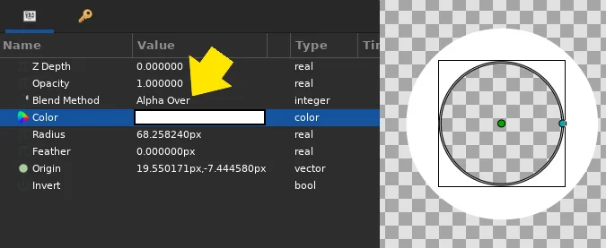
(Seth Kenlon, CC BY-SA 4.0)
This causes your white circle to turn anything it touches into part of the alpha channel. The alpha channel is a digital color channel, like red and green and blue (RGB), except that instead of representing an actual color, it means emptiness. Yes, alpha is the color of transparency.
This time, draw a third shape using the Rectangle tool (R on the keyboard). Place its origin in the center of your two circles, fill it in with red, and set its Blend Method to Multiply. This serves as the clock's hand. You can't see most of the hand because it's being multiplied by alpha (and any number multiplied by 0 is 0), but I do that because I've found that placing objects over people's faces in video tends to look jarring.
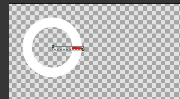
(Seth Kenlon, CC BY-SA 4.0)
Finally, use the Rectangle tool to draw a backdrop where the imaginary titles of the fictitious news program would be displayed. The rectangle appears over your layers, so drag it to the bottom of the Layer panel.
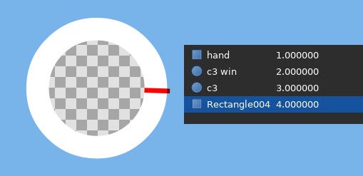
(Seth Kenlon, CC BY-SA 4.0)
Try adding some text and other elements on your own.
Group layers and effects
Layers aren't just a convenience in Synfig, they're the way compositing and effects are constrained. To animate the clock hand rotating around the clock face, you need to add a Rotate animation effect to your canvas, but if you did that without grouping layers, everything on your canvas would rotate instead of just the clock hand. Additionally, it's a Group Layer that allows you to make one change to several layers at a time, for example to resize or move your clock graphic,.
Select the clock hand layer and send it into a new Group Layer by clicking the folder icon at the bottom of the Layers panel.
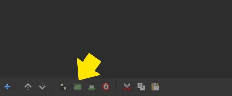
(Seth Kenlon, CC BY-SA 4.0)
Optionally, select all layers (your new Group Layer included) and send them into another Group Layer. Group layers don't cost extra, so I tend to use them liberally to keep my workspace visually organized and keep assets together so I can move and change them as objects rather than in bits and pieces.
Right-click on the clock hand layer and navigate to the New Layer entry at the top of the contextual menu. Find the submenu Transform and select Rotate to add a new rotation layer.
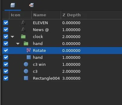
(Seth Kenlon, CC BY-SA 4.0)
Animation
Because you have the rotation effect in a Group Layer with your clock hand, the only thing it affects is the clock hand. However, nothing's rotating right now because you haven't animated anything yet.
Select the Rotate layer. It has two nodes: a green origin node and a blue amount node. Drag and drop the green origin node over the approximate origin of the clock hand. For maximum precision, you could instead obtain the exact origin position of the clock hand and enter the same number into the origin of the rotation effect.
Now it's time to enter Animation mode. Click the Animation mode button in the bottom right corner of the canvas.
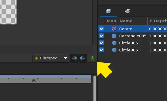
(Seth Kenlon, CC BY-SA 4.0)
You know when it's active because your whole canvas is given a bright red border, and the Animation mode button turns red.
In animation mode, everything you do in the canvas is recorded. Currently, you're positioned at the first frame of your animation, so anything you adjust now becomes the starting position.
Drag the blue node of the rotate layer to the 12 o'clock position. When you do, a golden key frame icon appears in your timeline. This indicates that a parameter has changed. You can tell which parameter changed by looking in the Parameters panel to the left of the timeline: a key frame icon is placed on the line of its parent parameter.
Click the 48th frame in the frame counter bar at the top of the timeline. Rotate the blue node of the rotate layer clockwise to the 11 o'clock position. A new key frame appears, this time under frame 48. This tells Synfig that you need 47 in-between frames to get your clock hand from 12 o'clock to 11 o'clock.
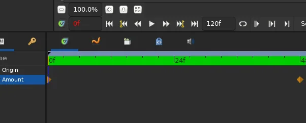
(Seth Kenlon, CC BY-SA 4.0)
Click the Animation mode button to leave animation mode.
To preview your animation, click the Play button at the bottom of the canvas.
Export
Go to the File menu and select Render to export your animation. The render menu can be complex because there are so many different targets possible for an animation. Generally, animations are exported as image sequences because most workflows bring animation into another application so that individual scenes can be edited together, joined with the final sound mix, and so on. Because this example project is intended as an overlay, that workflow makes sense here.
Choose to save your files as news-overlay.png in a dedicated directory. To keep the alpha channel, choose PNG as the Target. In the Time tab of the Render window, set End Time to just 64f. This ensures that all 48 frames of animation are exported and gives you a little for a quick fade-out. In real life, I'd expect an intro sequence to be longer than three seconds, but that's good enough for this example. Click the Render button to start the export.
If you don't have any video to overlay your motion graphic on top of, you can instead just render out a video file by selecting the ffmpeg target and save your file as an MP4 file.
Using your overlay
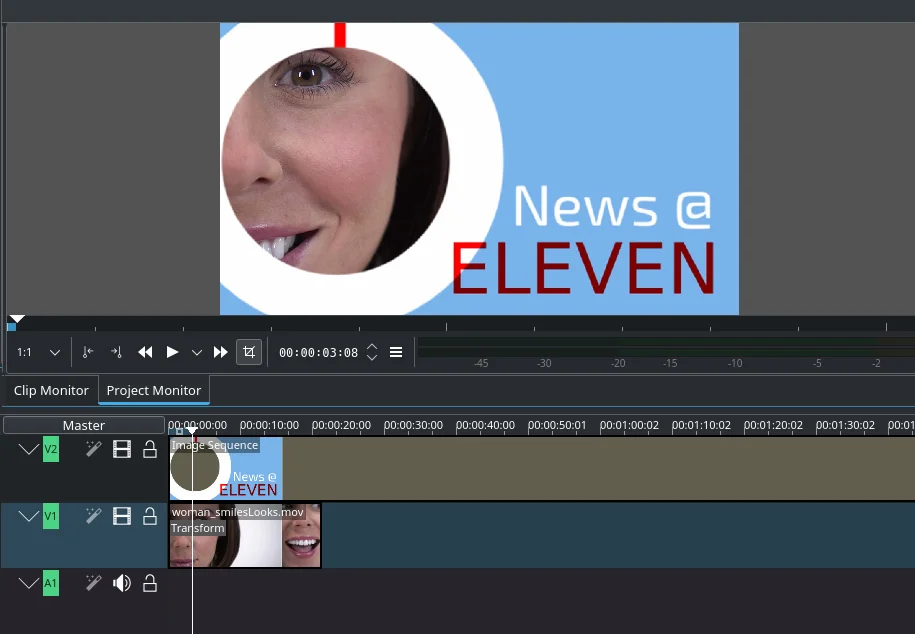
Most professional-grade video editors can import image sequences as if they were a video file. If you're using Kdenlive, use the Add Image Sequence option in the Project menu. Set the image type to PNG, and direct Kdenlive to your image sequence folder.
By placing the image sequence on video track 2 (V2) and video footage on video track 1 (V1), you're able to see a portion of the underlying video through your animated overlay.
(Seth Kenlon, CC BY-SA 4.0)
Animation ideas
Synfig does a lot of work for you. It gives you easy shortcuts for compositing, and it generates not frames but entire seconds of animation. This example project is simple, but it gives you an idea of some of the attributes you can adjust in Synfig. There are nearly a hundred animation effects ready for you to use, and most of them are a lot more interesting than just rotating a layer. With Synfig, you don't have to just animate shapes. You can also animate effects. It's all about parameters, compositing, and motion. Explore the layer effects, try some animation, and add a little Saul Bass-inspired motion graphics to your next project.



Comments are closed.